Chapter 11 Patent Analytics with Plotly
11.1 Introduction
In this chapter we provide an introduction to the online graphing service Plotly to create graphics for use in patent analysis.
Plotly is an online graphing service that allows you to import excel, text and other files for visualisation. It also has API services for R, Python, MATLAB and a Plotly Javascript Library. A recent update to the plotly package in R allows you to easily produce graphics directly in RStudio and to send the graphics to Plotly online for further editing and to share with others.
Plotly’s great strength is that it produces attractive interactive graphics that can easily be shared with colleagues or made public. It also has a wide variety of graph types including contour and heat maps and is built with the very popular D3.js Javascript library for interactive graphics. For examples of graphics created with Plotly see the public gallery. Plotly was founded in 2012 and is therefore quite new, however, Plotly is becoming a great tool for creating and sharing graphics. In this chapter our aim is to get you started with using Plotly online with .csv or Excel files. In the second part of the chapter we will focus on using the plotly package in RStudio to generate and export graphs.
11.2 Getting Started with Plotly
We need to start out by creating an account using the Create Account Button.
Next we will see an invitation to take a tour (which is worth doing) and Plotly helpfully points out that we can load files from Google Drive or Dropbox. We then select the Workspace option to begin work.
11.3 Importing Files
When you first arrive you will see a Workspace with a Grid (Plotly’s term for a table or worksheet).
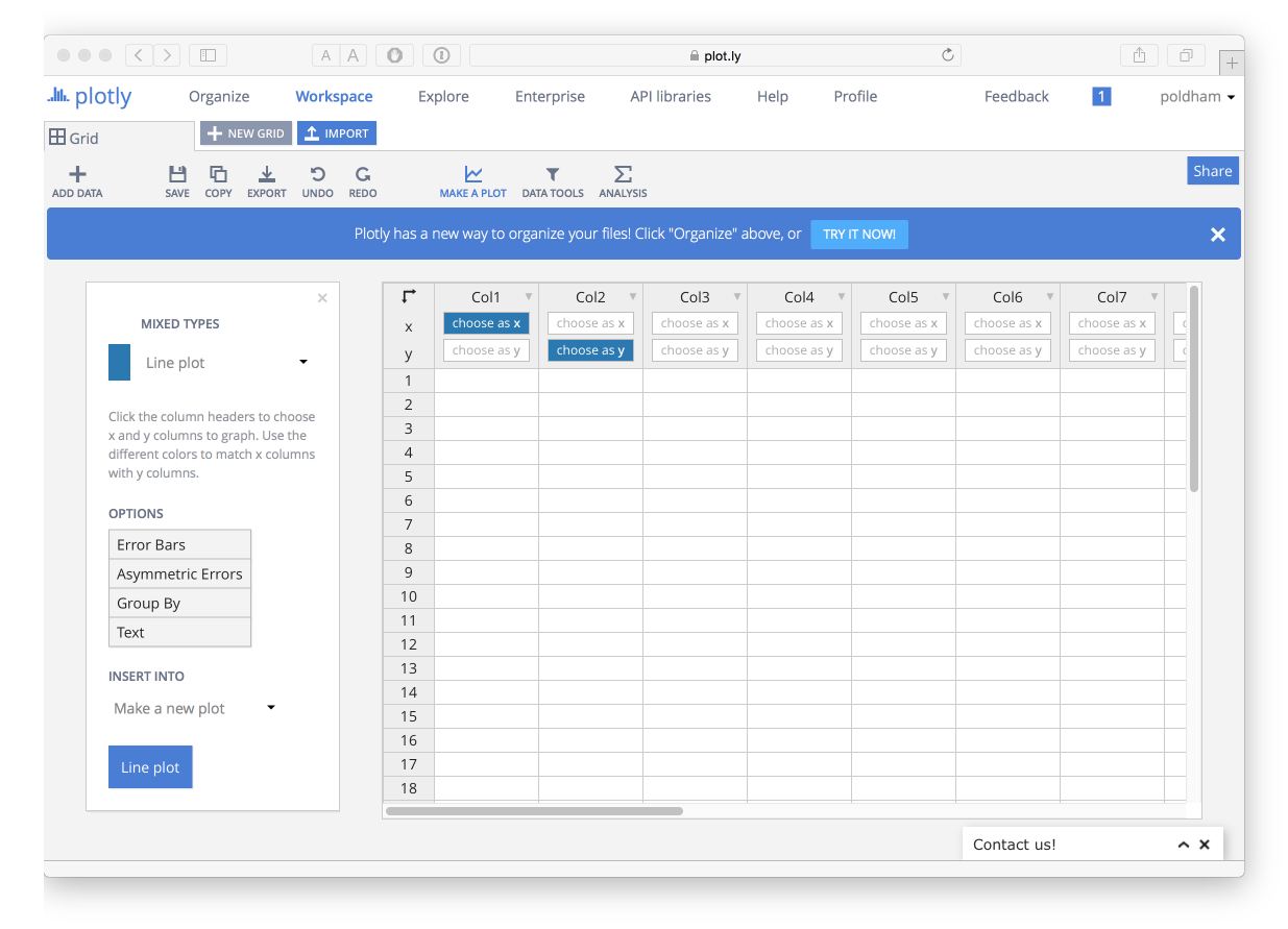
In the workspace you will see an Import Icon that provides a range of options for importing data. Don’t import anything yet! You can also copy data from a file and paste it into the Grid.
At the time of writing, the reason not to use these options at the moment is that while the data may import fine first time, in other cases it will not. Using the options on this page you will receive no information if an import fails. We also encountered problems with saving data that had been pasted into the worksheet (even where it appeared to work). To avoid potential frustration head over to Organize.
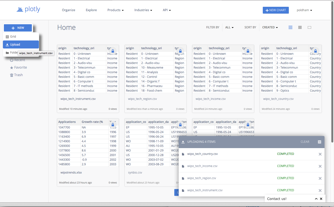
From the Organize page select the New button and then Upload. Now select your local file. When you upload the file a status message will display and if all goes well then you will see a completed message. If not a red message will display informing you that there has been a problem (how you fix these problems is unclear).
For this experiment we used two datasets from the Open Source Patent Analytics Manual data repository. When using the Github repository click on the file of interest until you see a View Raw message. Then right click to download the data file from there. You can download them for your own use directly from the following links.
- WIPO trends application trends by year and with % change.
- Pizza patents by country and year. This is a simple dataset containing counts of patent documents containing the word pizza from WIPO Patentscope broken down by country and year.
One important point to note is that Plotly is not a data processing tool. While there are some data tools, your data will generally need to be in a form that is suitable for plotting at the time of input. In part this reflects the use of APIs which allow for users of Python, R and Matlab to send their data to Plotly directly for sharing with others. This is one of the great strengths of Plotly and we will cover this below. However, we also experienced problems in loading and graphing datasets that were easy to work with in Tableau (as a benchmark). This suggests a need to invest time in understanding the formats that Plotly understands.
We experienced a different type of problem with the simple WIPO trends data where Plotly concatenated the first row (containing labels) and the first data row into one heading row. However, in most cases import seemed to be fine. To turn a row into a heading row try right clicking the row with the headings and right clicking on use row as col headers. Then right click again to remove the original row.
11.4 Creating a graphic
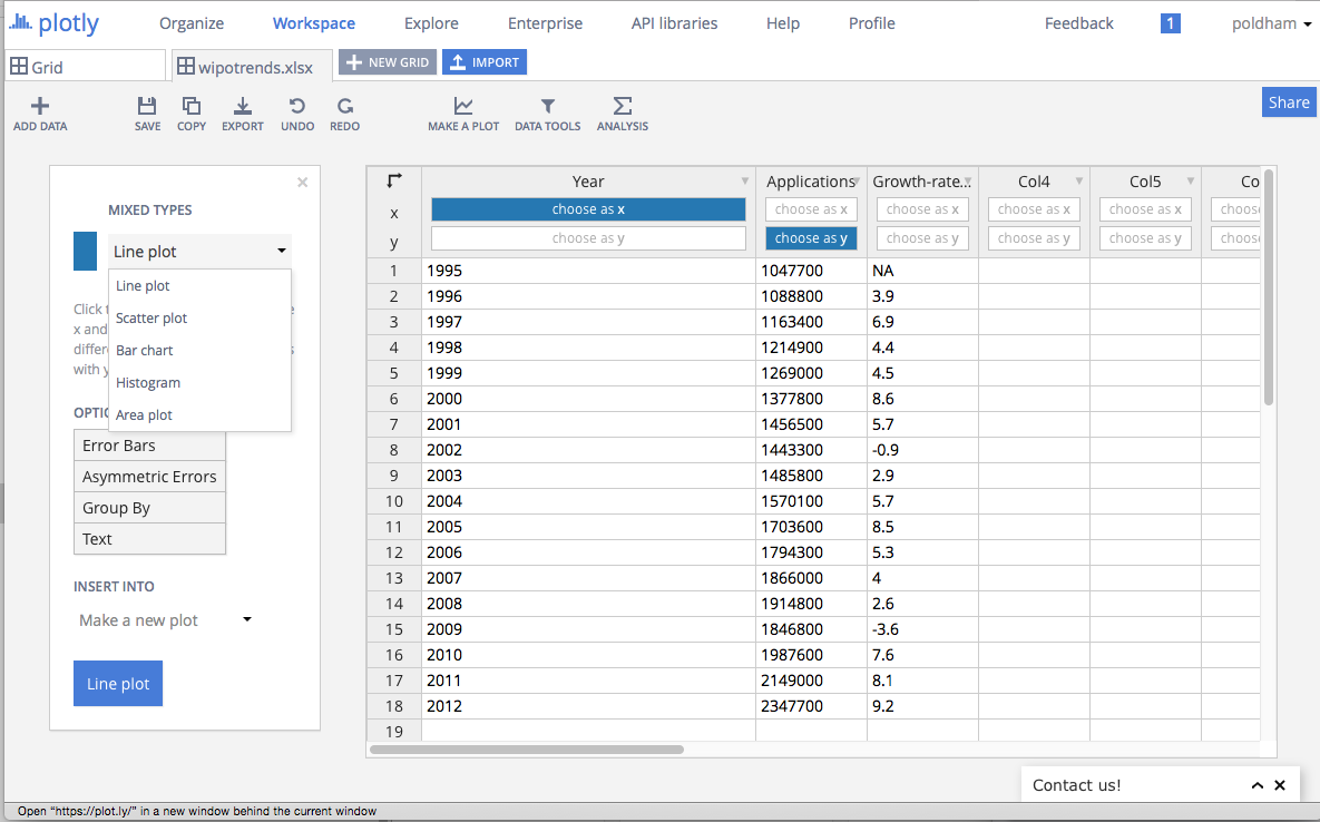
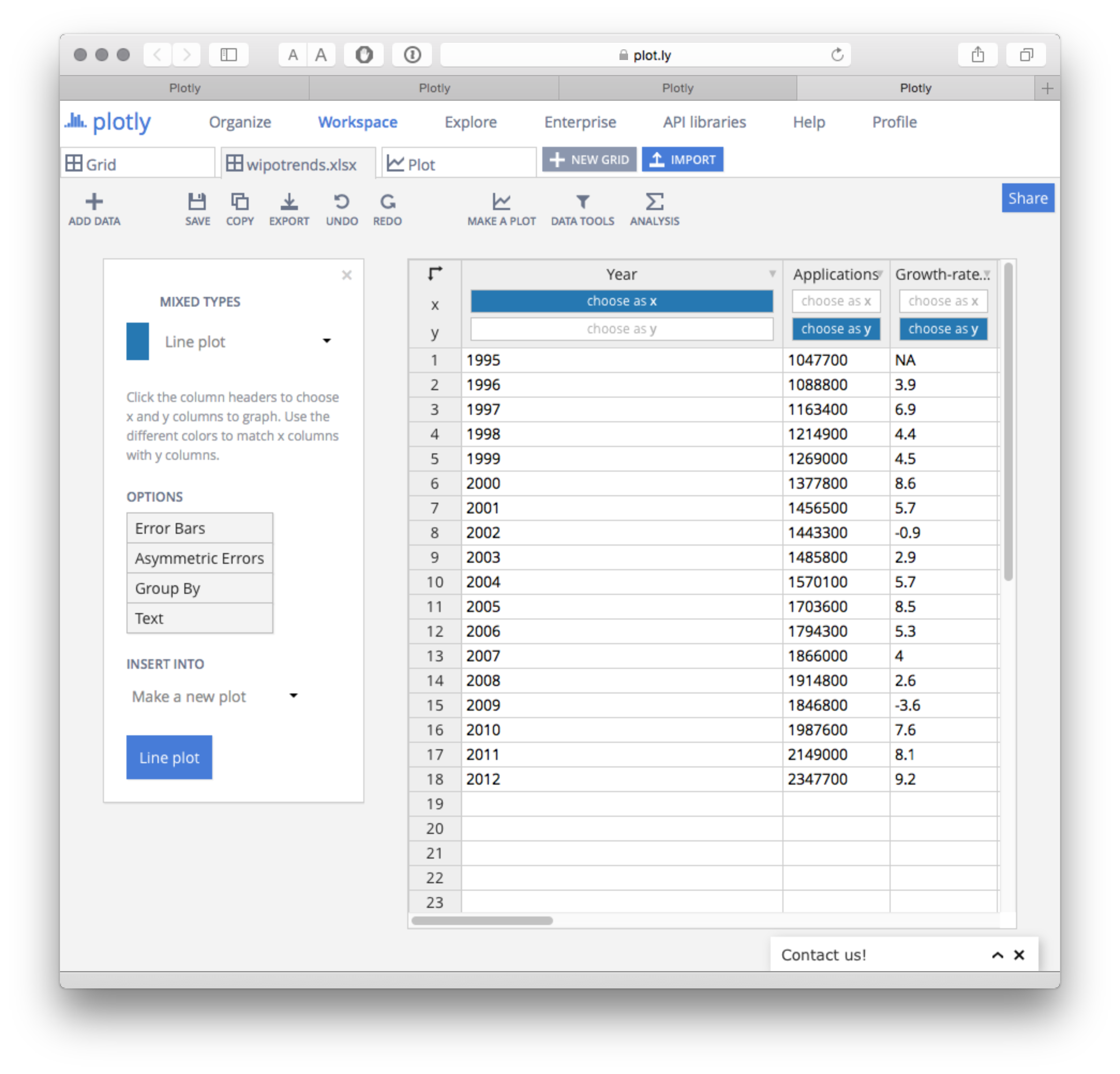
We will start with the simple WIPO trends data by opening up that Grid.
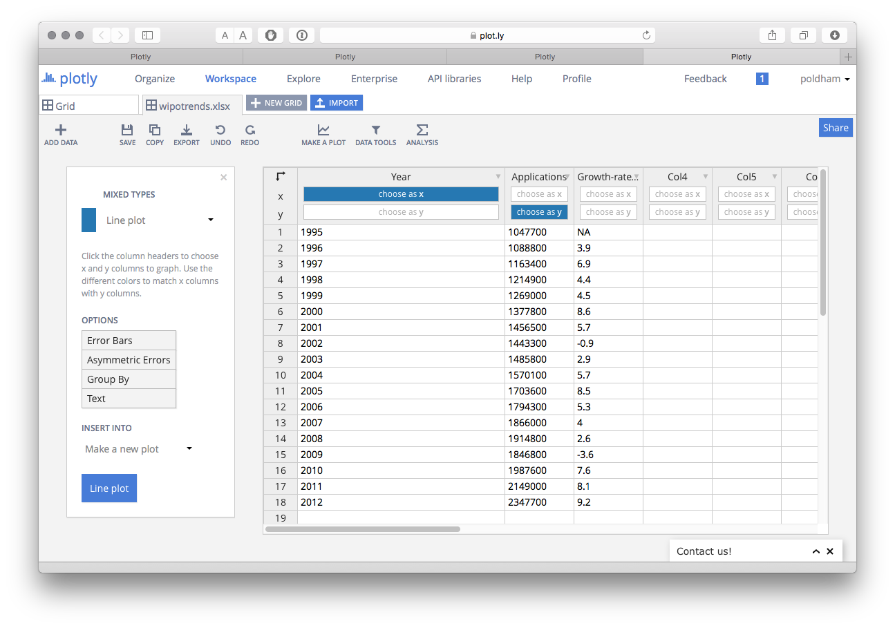
Note here that in the Grid we have options to select the x or y axis for plotting. There is also an Options menu that we will come back to.
The Type of plot can be changed by selecting the drop down menu as we can see below.
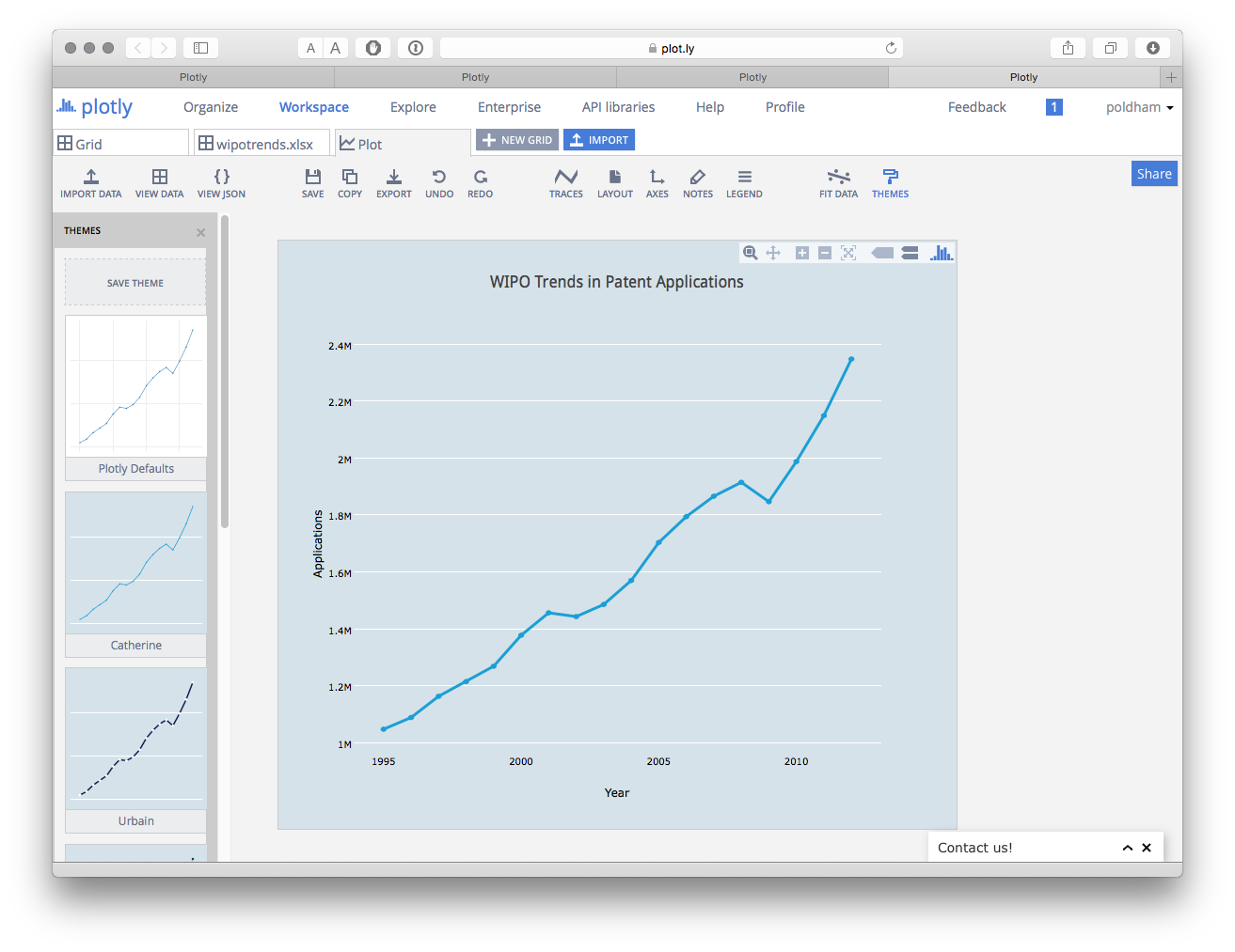
Sticking with a line graph, when we create the plot we can add a title and then change the theme (in this case to Catherine).
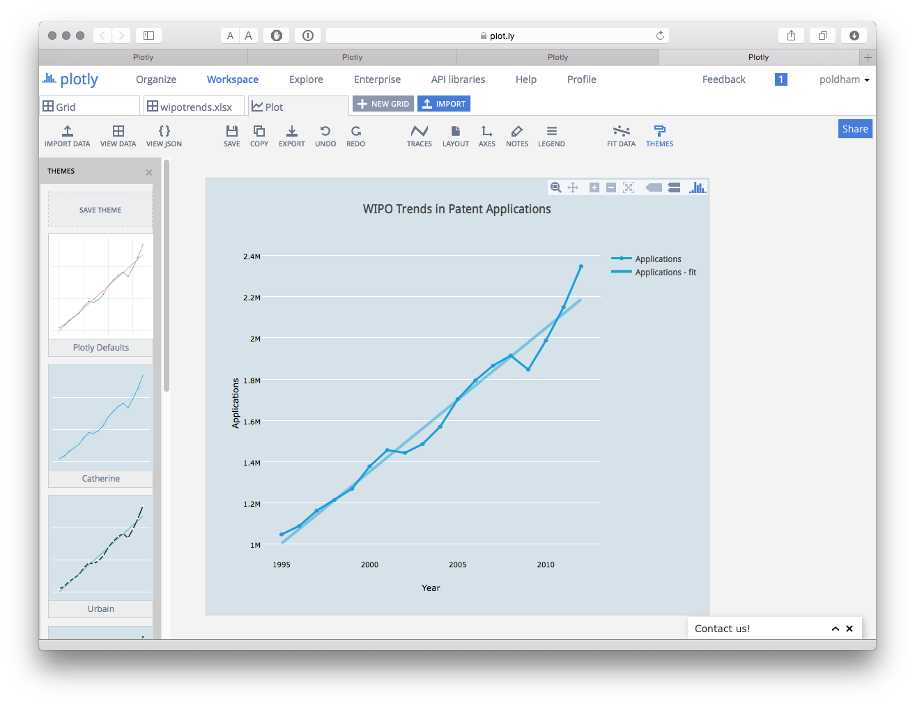
We could also add a fit line by selecting the FIT DATA menu icon. This will ask you to create a fit and then you have a range of preset functions or you can add your own. Here we have simply chosen the default Linear fit.
We can then save the plot and use the export button to save the plot in a variety of formats and sizes. It is also very easy to add annotations using the Notes icon. Confusingly, the large blue Share button only seems to save the file and despite saving the plot we were not able to locate it again. While Plotly certainly looks nice, and appears to have attractive functions it is not intuitive and the difficulties involved in importing and sharing can be frustrating and time consuming. In short, time is needed to invest in and explore the potential of this tool.
11.4.1 Adding a Second Axis
If we go back to our original WIPO trends data we have a percentage score for the year on year change in patent applications. We might want to show this on a plot with a second axis for the percentage.
To do that in the Grid view select the button “choose as y” in the Growth-rate column to add a second item for the y axis.
When we choose Line plot we will now see the two sets of data with the percentage trailing on the bottom. We now need to create a second y axis on the right and assign the percentage data to that.
To do this select the Traces icon and a menu will pop up showing the data traces. The drop down menu under Traces will show Applications, so, select Growth Rate % from the drop down menu. Then where you see Lines/Markers select the dot. This will prevent the percentage scores displaying as a line.
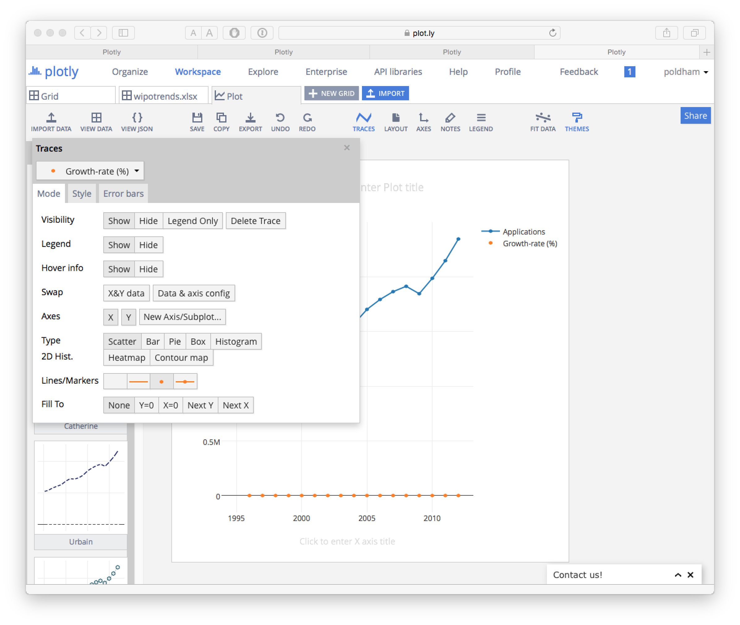
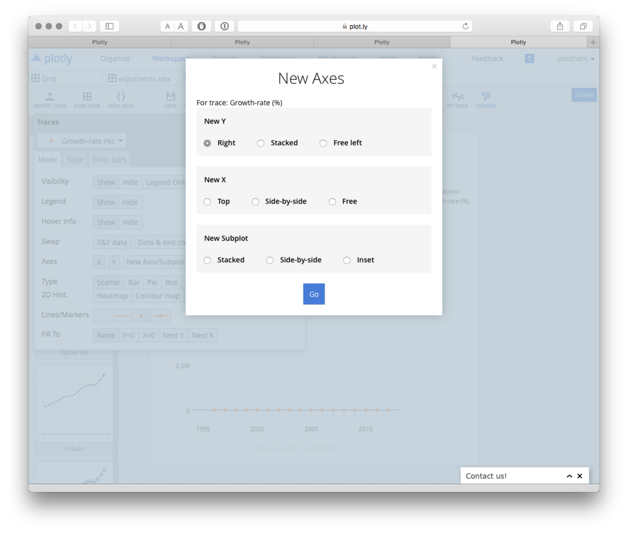
Next, in the same panel under Axes select New Axis/Subplot and a new screen will pop up. We have some choices here but will simply choose to create a new axis on the right.
The result will look something like this.
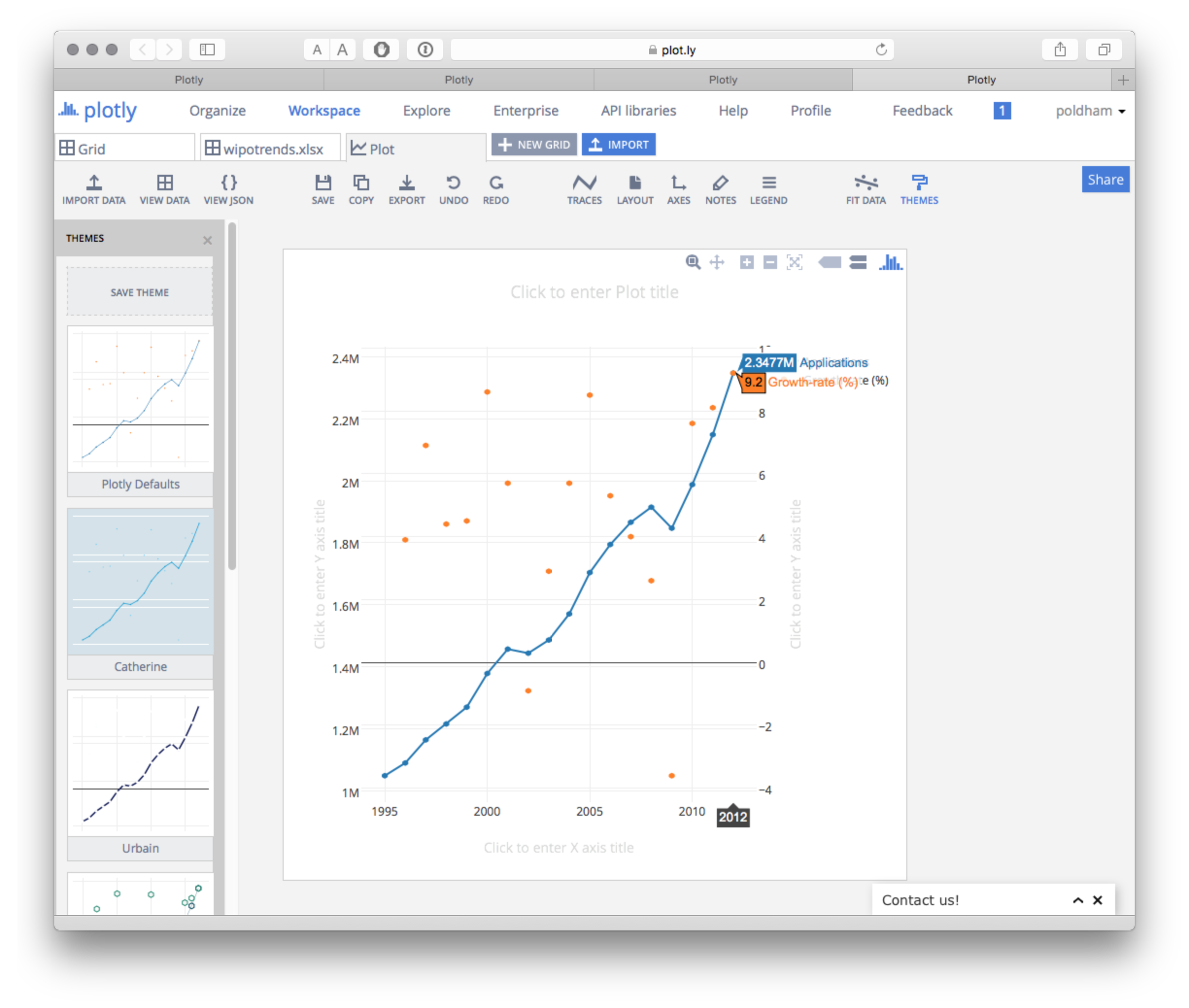
Our issue now is equalising the axes and changing the size of the points for the percentage scores. Finally we can add a title.
Before we go any further let’s note that we have a significant minus axis value of -3.6% in 2009 when patent applications declined. There is also a minus value in 2002.
If we wanted to retain these values we would probably want to turn off the second set of grid lines. We would also want to resize the points.
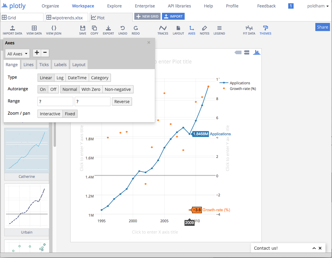
To turn off the grid lines on the second y axis Click on the Axes icon in the main menu on the left. Then from the All Axes drop down under Axes select Y Axis 2. Then click the Lines submenu icon and turn Lines and Grid lines to OFF. Also turn the Zero line to OFF unless you want to retain it.
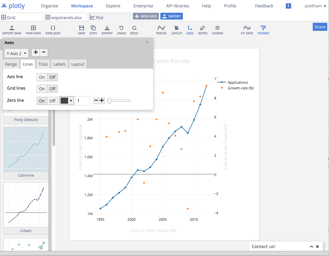
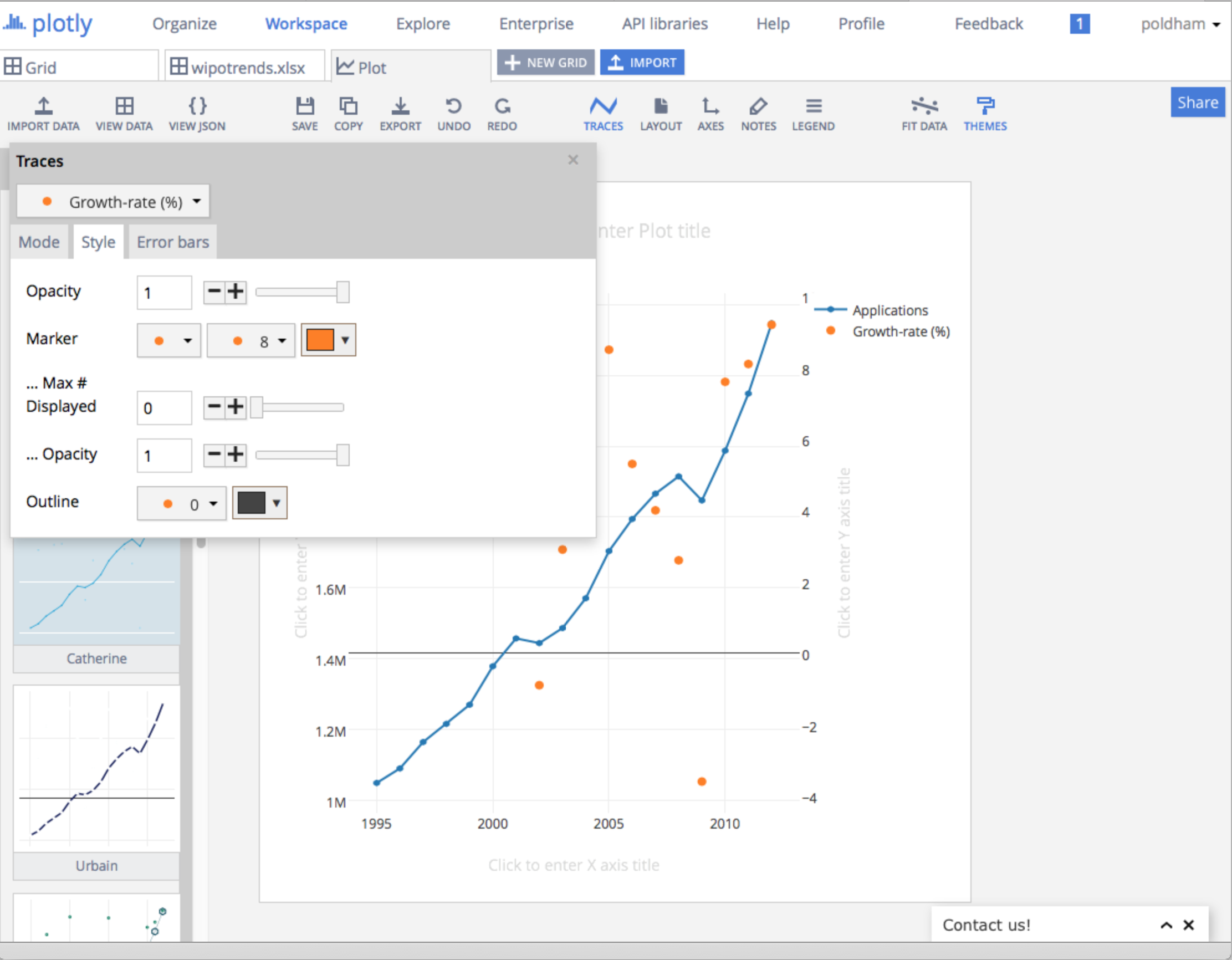
To resize the points we need to go back to the Traces main menu on the left and select Growth Rate from the list of Traces. Then choose the Style tab and change the marker size to something larger such as 8.
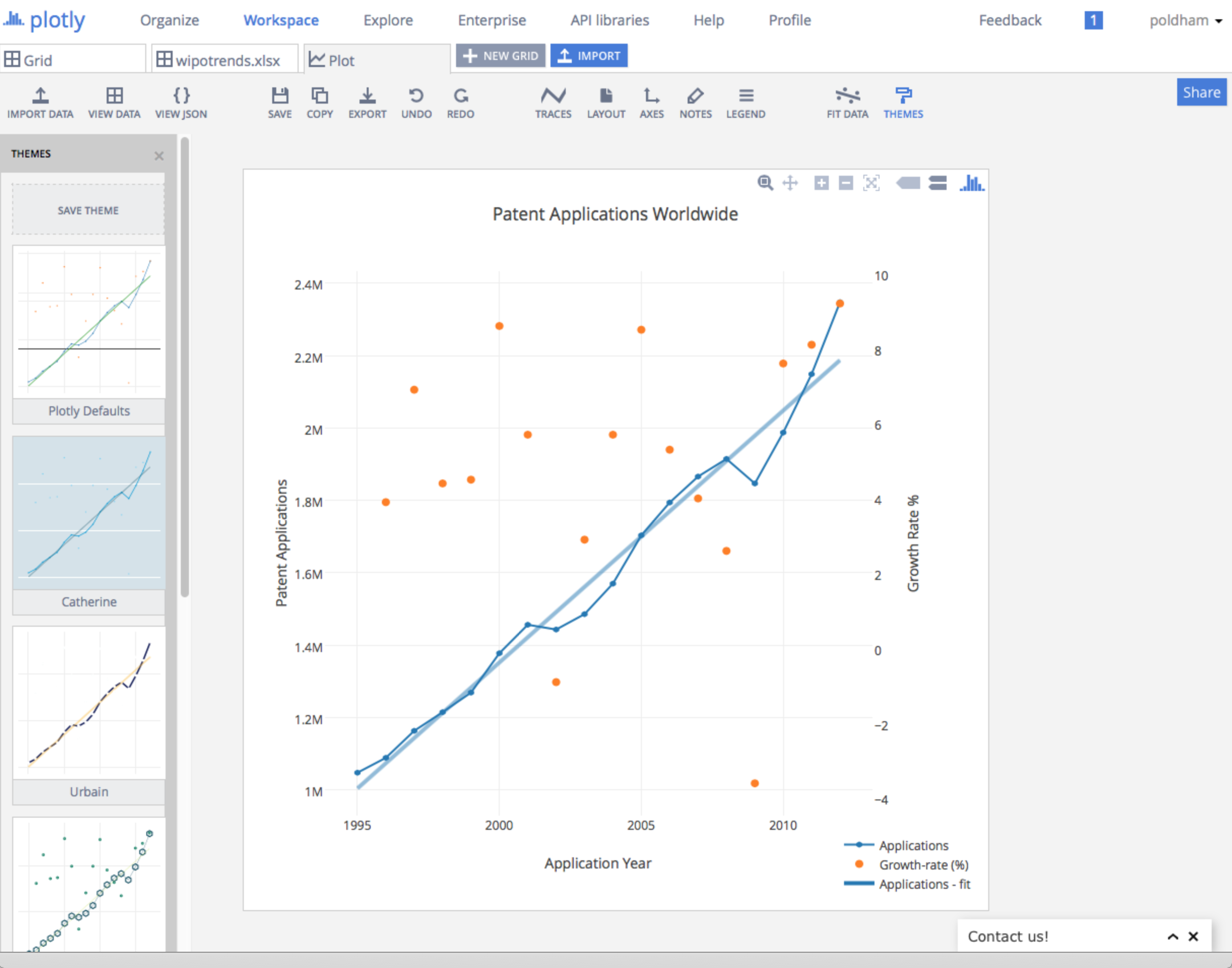
To finish off the graphic we will want to add some labels. We can simply type in the Axis labels and a title into the text boxes provided. By choosing the Legend icon we could turn the legend on or off. Note that while this graph could be seen as self explanatory it may not be for the reader. We can also simply drag the axes labels to a different position.
It is possible that we would want to remove the negative values from the plot (in that case the values would need to be explained in the accompanying text). To do that select Axes, then Y Axis2 then in Autorange choose Non-negative to show only values greater than zero on the plot.
If we wished we could also apply a fit line by choosing the Fit Data icon. We will choose Linear.
Finally, to finish off the plot we might want to add annotations using the NOTES icon. Simply click on the plus sign in the pop up menu for a new annotation and then select the arrow and text and move it into the position you want.
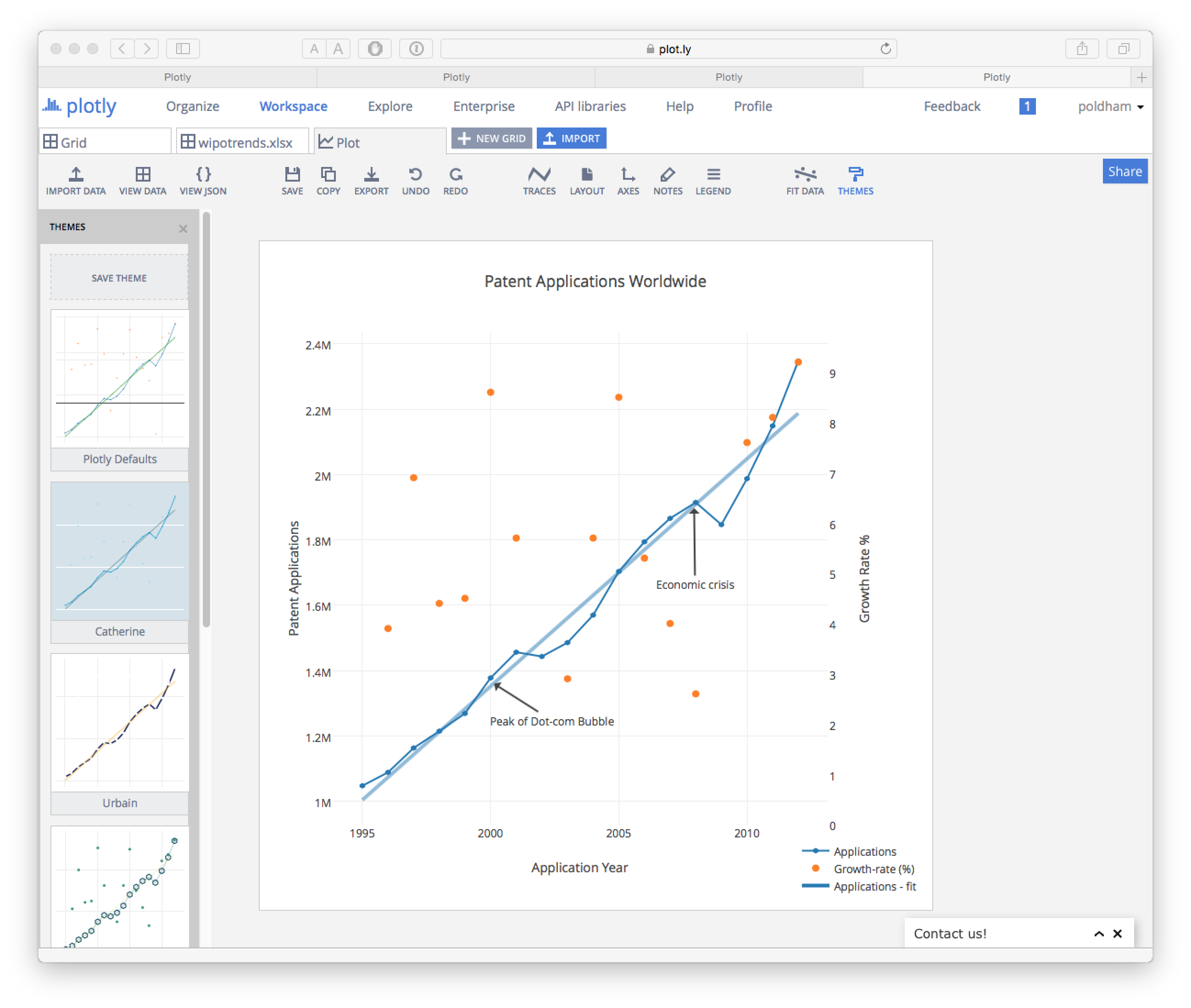
In this case we have added a couple of markers that may help to understand trends in activity. First, we have a dip in patent applications between 2001 and 2002. One possible explanation here is that this is a knock on effect of the collapse of the dot.com bubble where share prices reached a peak in 2000, declined rapidly and recovered before declining again into 2001. Patent data typically displays lag effects and it is reasonable to think that the decline in application activity from 2001 reflects these wider economic adjustments. Similarly, there is a significant dip in applications between 2008 and 2009 that it appears reasonable to assume reflects the knock on effects of the global economic crisis of 2007-2008. Note here that these are crude way markers to assist with interpreting the graphics. We could choose to add other timeline style events or layer graphics to help understand the potential or actual relationships between wider economic activity and trends in patent applications worldwide.
11.5 Saving and Sharing
To save the plot we simply click Save. However, it is here that one of Plotly’s major strengths becomes apparent. As soon as we save the plot we can also invite others by email, we can create a public or private shareable link. For the collaborators, they must have a Plotly account already for this to work.
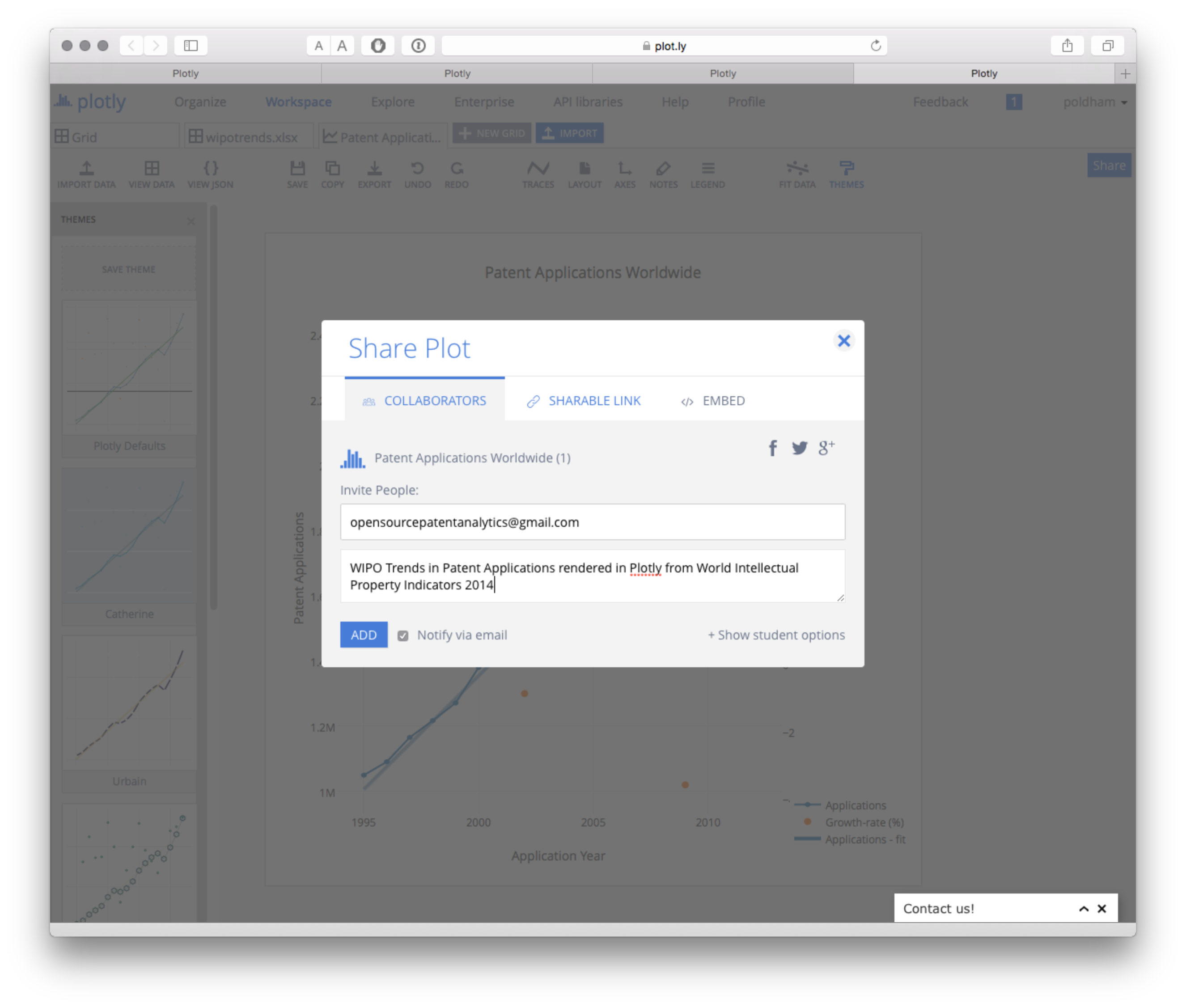
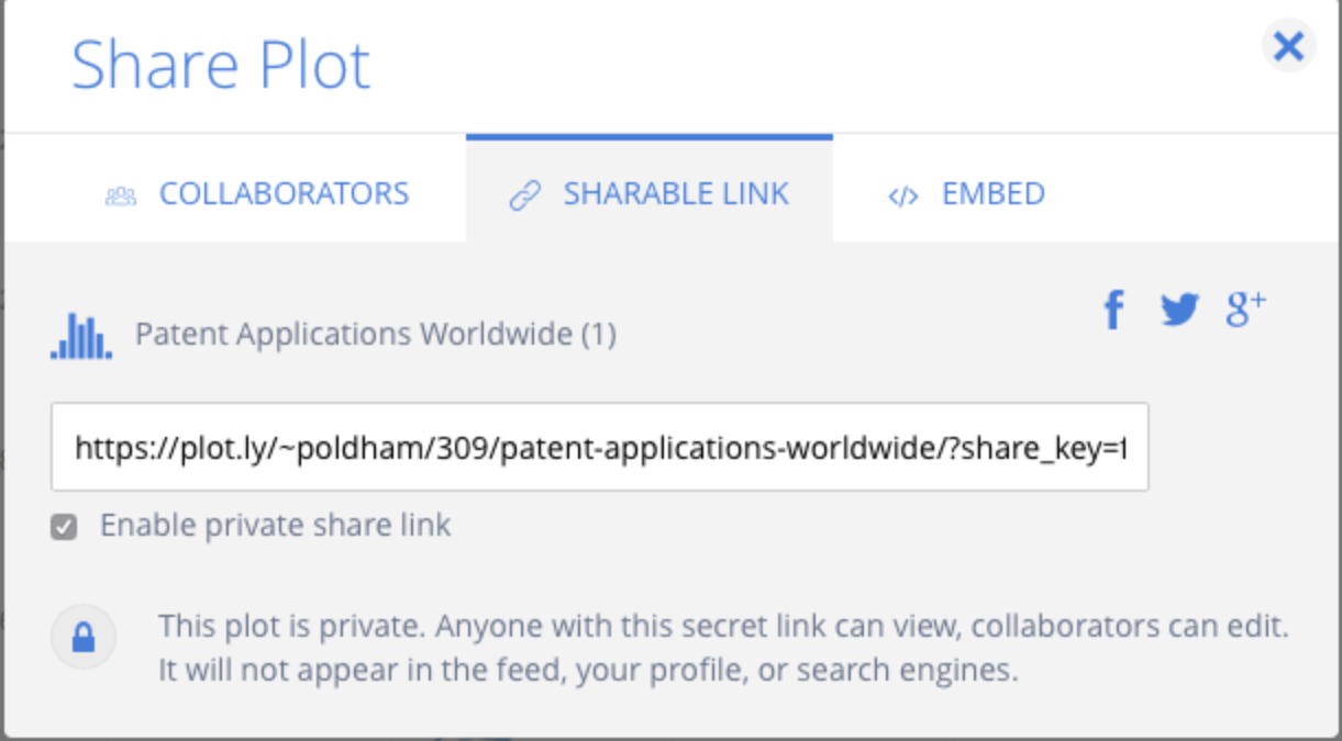
The next option is to share a link. Note here that the default is to share a private link. To change that select the lock icon. The private link is particularly well suited for patent professionals.
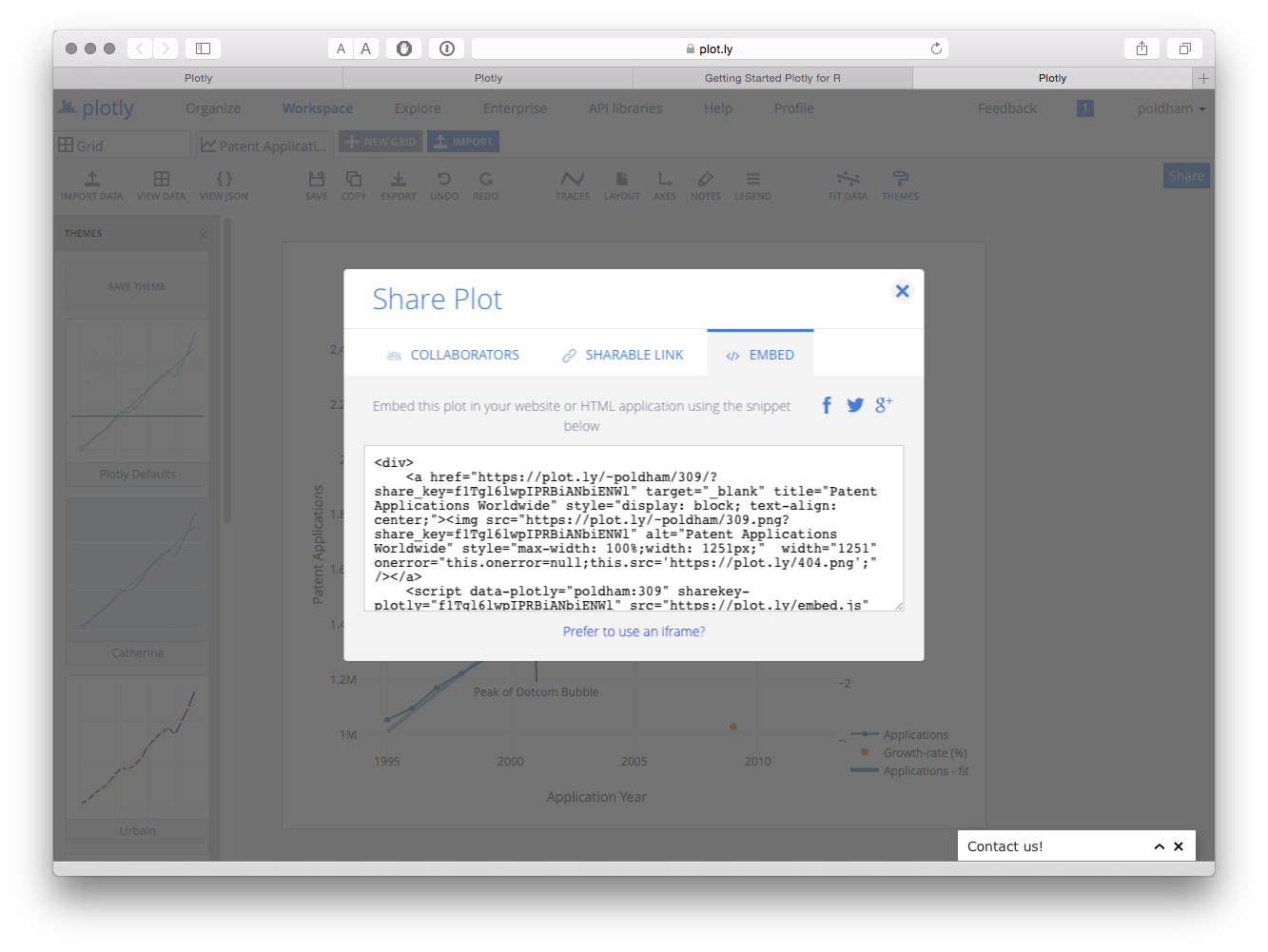
You could also grab an embed code to embed the plot in a web page
Alternatively, surprise your friends and relatives by posting the plot on facebook or share with a wider audience on Twitter.
In this example we have focused on developing a very simple plot using plotly. In practice there are a wide range of possible plotting options with a growing number of tutorials provided here.
11.6 Working with Plotly in R
We are following the instructions for setting up Plotly in R. We will be using RStudio for this experiment. Download RStudio for your operating system here and make sure that you also install R at the same time from the link on the RStudio page here. For Python try these installation instructions to get started.
In RStudio first we need to install the plotly package. We will also install some other helpful packages for working with data in R. Either select the Packages tab in RStudio and type plotly and install, or type the following in the console and press Enter.
install.packages("plotly") # the main event
install.packages("readr") # import csv files
install.packages("dplyr") # wrangle data
install.packages("tidyr") # tidy data
Then load the libraries.
library(plotly)
library(readr)
library(dplyr)
library(tidyr)
We now need to set our credentials for the API. When logged in to plotly follow this link to obtain your API key. Note also that you can obtain a streaming API token on the same page. Streaming will update a graphic from inside RStudio.
When you have obtained your token use the following command to store your username and the API key in your environment.
Sys.setenv("plotly_username" = "your_plotly_username")
Sys.setenv("plotly_api_key" = "your_api_key")
Next we will load a dataset of WIPO Patentscope data containing sample data on patent documents containing the word pizza organised by country and year (pcy = pizza, country, year).
library(readr)
pcy <- read_csv("https://github.com/wipo-analytics/opensource-patent-analytics/raw/master/2_datasets/pizza_medium_clean/pcy.csv")
Because patent data generally contains a data cliff for more recent years we will filter out recent years using filter() from the dplyr package by specifying a year that is less than or equal to 2012. To take out the long tail of limited historic data we will specify greater than or equal to 1990.
library(dplyr)
pcy <- filter(pcy, pubyear >= 1990, pubyear <= 2012) %>%
  print()
## # A tibble: 223 x 4
## pubcountry pubcode pubyear n
## <chr> <chr> <int> <int>
## 1 Canada CA 1990 19
## 2 Canada CA 1991 49
## 3 Canada CA 1992 66
## 4 Canada CA 1993 59
## 5 Canada CA 1994 50
## 6 Canada CA 1995 39
## 7 Canada CA 1996 36
## 8 Canada CA 1997 45
## 9 Canada CA 1998 46
## 10 Canada CA 1999 47
## # … with 213 more rowsTo create the plot in plotly we use the plot_ly() function. We will specify the dataset, the x and y axis and then the colour for the country data (known as a trace in plotly language). We will then add a title using the %>% pipe operator for “this” then “that”. To specify the visual we want we specify the mode as “lines”" (try “markers” for a scatter plot).
library(plotly)
s <- plot_ly(pcy, x = pubyear, y = n, color = pubcountry, mode = "lines") %>%
  layout(title = "Patenscope Pizza Patent Trends")
s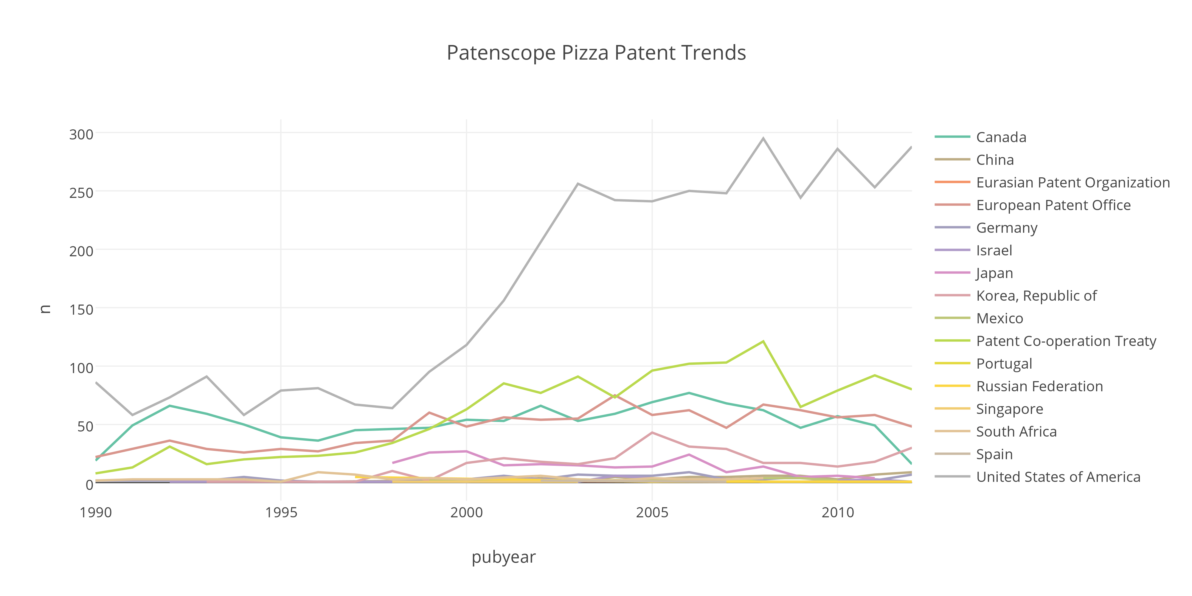
Our data has more entries than there are colours in the default color palette. Plotly will record a warning on the number of colours but we can now clearly see a plot. If we have entered our credentials for the API (above) we can also push the graph online along with the data for further editing or to share with others.
library(plotly)
plotly_POST(s)
This will open a browser window and ask you to sign up or login before being taken to the graph.
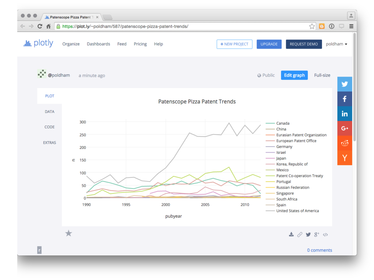
As this makes clear, it is easy to generate a plotly graph in R but we will want to dig into the plotly package in a little more detail.
To change colours it is helpful to note that plotly installs and then calls the RColorBrewer package (it will display in the Packages list). To see the colour palettes we first tick RColorBrewer in Packages (or library(RColorBrewer)) to load it.
To view the available palettes you could simply use View(brewer.pal.info) or the following chunk which arranges the data by the number of colours.
library(RColorBrewer)
library(dplyr)
brewer.pal.info$names <- row.names(brewer.pal.info)
select(brewer.pal.info, 4:1) %>%
  arrange(desc(maxcolors))
## names colorblind category maxcolors
## Paired Paired TRUE qual 12
## Set3 Set3 FALSE qual 12
## BrBG BrBG TRUE div 11
## PiYG PiYG TRUE div 11
## PRGn PRGn TRUE div 11
## PuOr PuOr TRUE div 11
## RdBu RdBu TRUE div 11
## RdGy RdGy FALSE div 11
## RdYlBu RdYlBu TRUE div 11
## RdYlGn RdYlGn FALSE div 11
## Spectral Spectral FALSE div 11
## Pastel1 Pastel1 FALSE qual 9
## Set1 Set1 FALSE qual 9
## Blues Blues TRUE seq 9
## BuGn BuGn TRUE seq 9
## BuPu BuPu TRUE seq 9
## GnBu GnBu TRUE seq 9
## Greens Greens TRUE seq 9
## Greys Greys TRUE seq 9
## Oranges Oranges TRUE seq 9
## OrRd OrRd TRUE seq 9
## PuBu PuBu TRUE seq 9
## PuBuGn PuBuGn TRUE seq 9
## PuRd PuRd TRUE seq 9
## Purples Purples TRUE seq 9
## RdPu RdPu TRUE seq 9
## Reds Reds TRUE seq 9
## YlGn YlGn TRUE seq 9
## YlGnBu YlGnBu TRUE seq 9
## YlOrBr YlOrBr TRUE seq 9
## YlOrRd YlOrRd TRUE seq 9
## Accent Accent FALSE qual 8
## Dark2 Dark2 TRUE qual 8
## Pastel2 Pastel2 FALSE qual 8
## Set2 Set2 TRUE qual 8This indicates that the maximum number of colours in a palette is 12. Let’s try Paired for illustration. This has the advantage of being colour blind friendly.
library(plotly)
library(dplyr)
s1 <- plot_ly(pcy, x = pubyear, y = n, color = pubcountry, colors = "Paired", mode = "lines") %>%
  layout(title = "Pizza Patent trends")
s1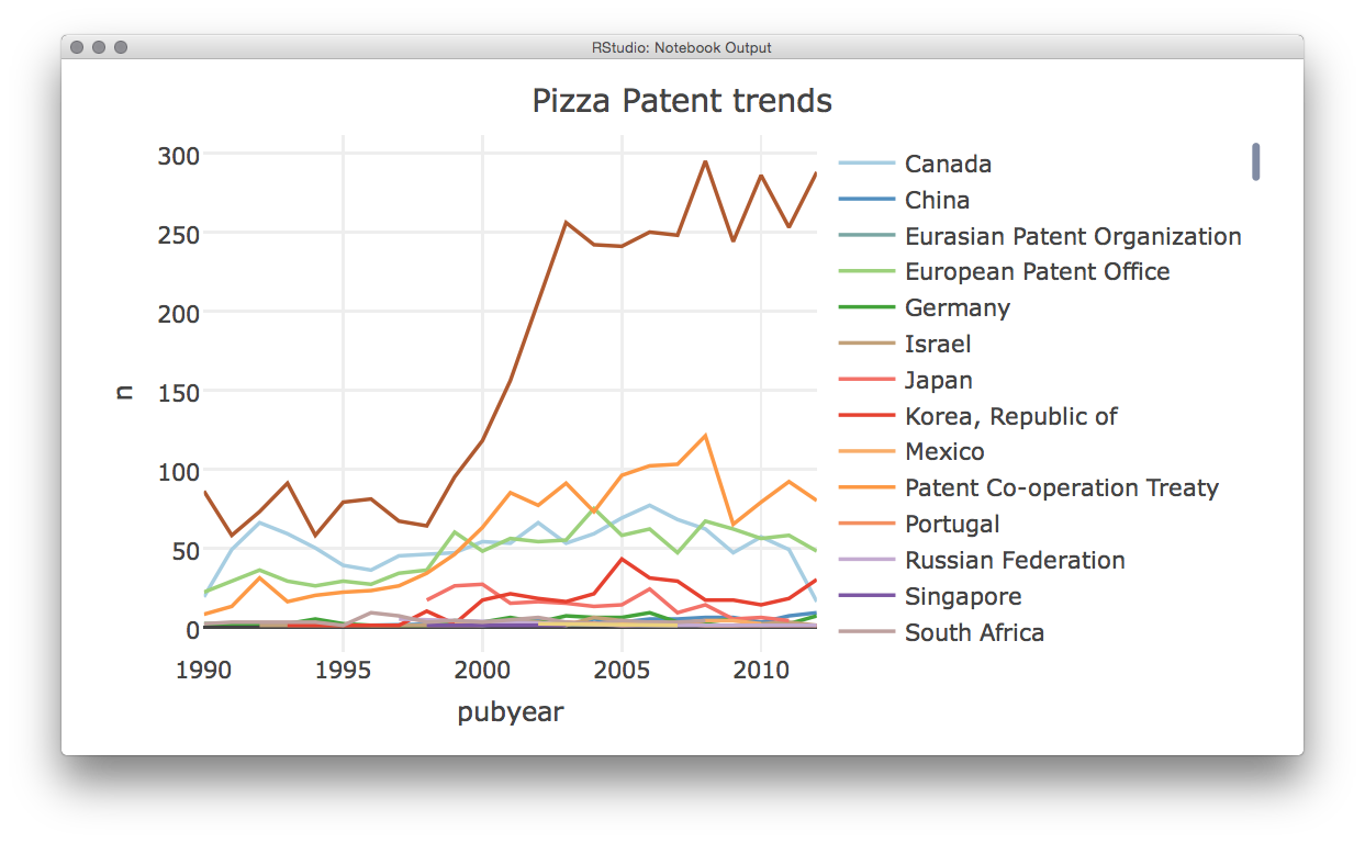
As we can see this will then produce a plot with the color palette, plotly will show a warning that the base palette (“Set2”) has 8 colours but will then specify that it is displaying the palette that we requested.
In practice we would want to break this plot into subplots for two reasons. First, the data and value ranges vary widely between countries and second, it is better to ensure that colours are distinct.
To do this we need to run some calculations on the data. We will use functions from dplyr and tidyr to quickly tally the data grouping by the publication code. Then we will add the data to discreet groups based on the scores using mutate() (to add a variable) and ntile() to divide the countries into groups based on the number of records (n) and add this to the new variable called group. Finally, we arrange the data in descending order based on the number of records.
library(dplyr)
library(tidyr)
total <- tally(group_by(pcy, pubcode)) %>%
  mutate(group = ntile(n, 3)) %>%
  rename(records = n) %>%
  arrange(desc(records))
total
## # A tibble: 16 x 3
## pubcode records group
## <chr> <int> <int>
## 1 CA 23 3
## 2 DE 23 3
## 3 EP 23 3
## 4 US 23 3
## 5 WO 23 3
## 6 KR 18 2
## 7 ZA 18 2
## 8 CN 15 2
## 9 IL 15 2
## 10 JP 14 2
## 11 MX 9 1
## 12 PT 6 1
## 13 RU 6 1
## 14 EA 3 1
## 15 ES 2 1
## 16 SG 2 1When we view total we now see that countries have been divided into 3 groups based on their number of records. Groups 1 and 2 are unlikely to provide a meaningful graph and group 1 in particular could be dropped. However, we could usefully display this information as a bar chart using plot_ly and selecting type = "bar".
library(plotly)
library(dplyr)
total_bar <- plot_ly(total, x = pubcode , y = records, type = "bar")
total_bar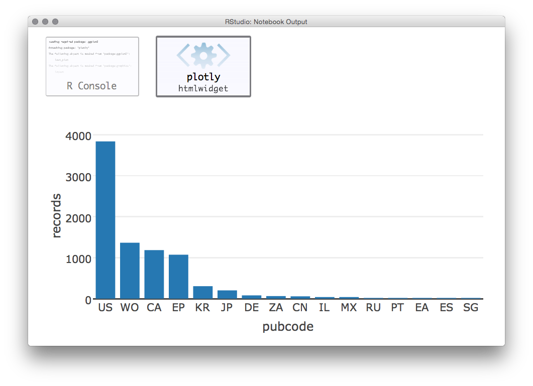
Having divided our data into three groups it would now be useful to plot them separately. Here we face the problem that our original data in pcy displays values by year while total displays the total number of records and group. We need first to add the group identifiers to the pcy table. To do that we will modify total to drop the count of records in records using the dplyr select() function. Then we will use left_join() to join the total and total_group tables together. Note that the function will use the shared field “pubcode” for joining.
library(dplyr)
total_group <- select(total, pubcode, group)
total_group
## # A tibble: 16 x 2
## pubcode group
## <chr> <int>
## 1 CA 3
## 2 DE 3
## 3 EP 3
## 4 US 3
## 5 WO 3
## 6 KR 2
## 7 ZA 2
## 8 CN 2
## 9 IL 2
## 10 JP 2
## 11 MX 1
## 12 PT 1
## 13 RU 1
## 14 EA 1
## 15 ES 1
## 16 SG 1Then we join the two tables and rename n to records for graphing.
library(dplyr)
total_grouped <- left_join(pcy, total_group) %>%
  rename(records = n)
## Joining, by = "pubcode"total_grouped## # A tibble: 223 x 5
## pubcountry pubcode pubyear records group
## <chr> <chr> <int> <int> <int>
## 1 Canada CA 1990 19 3
## 2 Canada CA 1991 49 3
## 3 Canada CA 1992 66 3
## 4 Canada CA 1993 59 3
## 5 Canada CA 1994 50 3
## 6 Canada CA 1995 39 3
## 7 Canada CA 1996 36 3
## 8 Canada CA 1997 45 3
## 9 Canada CA 1998 46 3
## 10 Canada CA 1999 47 3
## # … with 213 more rowsThe next step is to generate a set of three plots corresponding with our three groups. We will call them pizza3, pizza2 and pizza1 and use the full publication country name in pubcountry as the colour for the lines.
library(plotly)
library(dplyr)
pizza3 <- filter(total_grouped, group == 3) %>%
  plot_ly(x = pubyear, y = records, color = pubcountry, type = "lines", mode = "lines")
pizza2 <- filter(total_grouped, group == 2) %>%
  plot_ly(x = pubyear, y = records, color = pubcountry, type = "lines", mode = "lines")
pizza1 <- filter(total_grouped, group == 1) %>%
  plot_ly(x = pubyear, y = records, color = pubcountry, type = "lines", markers = "lines")
We now have a total of four draft plots, total_bar and pizza 3 to 1 for our groups. Plotly will allow us to display plots side by side. Note that this can create quite a crunched display in RStudio and is best viewed by selecting the small show in new window button in the RStudio Viewer.
library(plotly)
sub <- subplot(total_bar, pizza3, pizza2, pizza1)
sub
plotly_POST(sub)
You will now see an image that looks a lot like this.
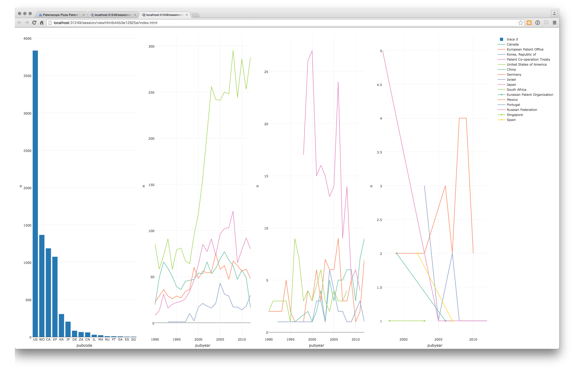
The figure reveals no coherent trend for the countries in Group 1 on the right and it makes sense to drop this data. Group 2 is potentially more interesting but the low overall numbers and the spikes for data for Japan suggests very low activity and a lack of complete data. Furthermore, ideally we would want to allocate different colours to the different names in our trends panels (probably by allocating different palettes) which could take considerable time relative to the gains in terms of displaying low frequency data. We will let the bar chart do that work and finish with a simple two plot graphic to send to plotly online.
library(plotly)
sub1 <- subplot(total_bar, pizza3)
plotly_POST(sub1)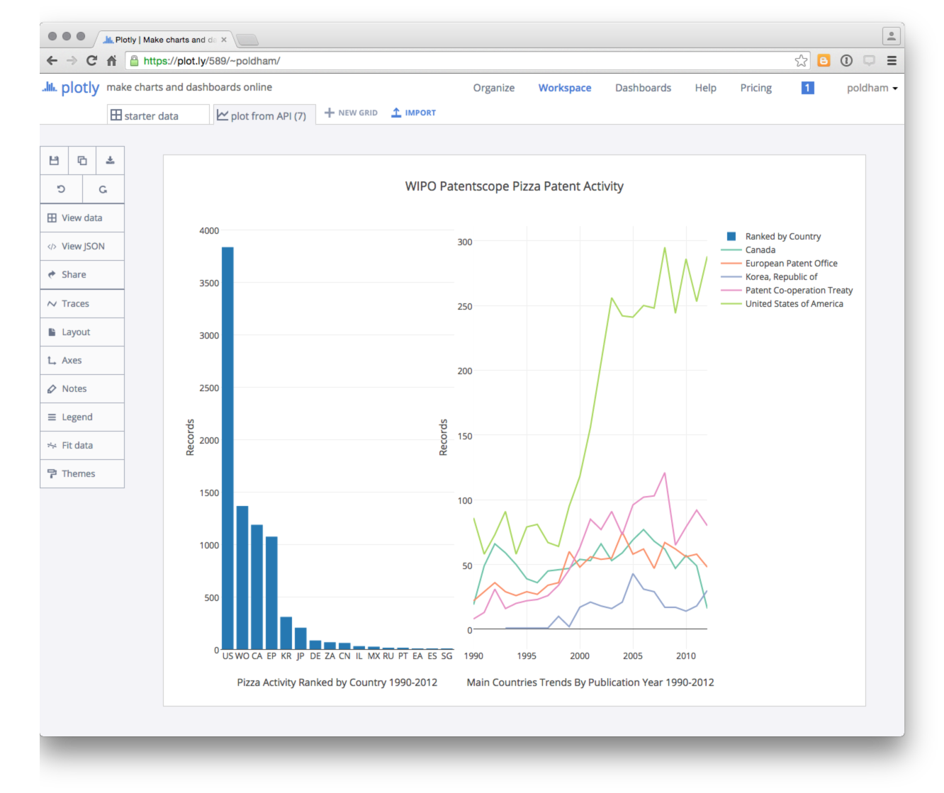
It is then easy to edit the labels and make final adjustments online.
We can also share the graph via social media, download the data, or edit the graph. Note that the default setting for a graph sent via the API appears to be public (with no obvious way to change that).
It is here that Plotly’s potential importance as a tool for sharing data and graphics becomes apparent. It is a powerful tool. Recent updates to the R package and the introduction of dashboards demonstrates ongoing improvements to this new service.
11.7 Round Up
In this chapter we have provided a brief introduction to Plotly to help you get started with using this tool for patent analytics. Plotly provides visually appealing and interactive graphics that can readily be shared with colleagues, pasted into websites and shared publicly. The availability of APIs is also a key feature of Plotly for those working in Python, R or other programmatic environments.
However, Plotly can also be confusing. For example, we found it hard to understand why particular datasets would not upload correctly (when they can easily be read in Tableau). We also found it hard to understand the format that the data needed to be in to plot correctly. So, Plotly can be somewhat frustrating although it has very considerable potential for sharing appealing graphics. The recent addition of dashboards is also a promising development. Finally, for R users, the plotly package now closely integrates with the very popular ggplot2 package through the ggplotly() function which allows for the creation of interactive ggplot2 graphics.
In this chapter we have only touched on the potential of Plotly as a powerful free tool for creating interactive graphics. Other kinds of plots that are well worth exploring include Bubble maps, contour maps and heat maps. To experiment for yourself try the Plotly tutorials.