Flourish is a visualization platform and tool allowing to easily turn our data into maps, charts and interactive stories.
Show code
knitr::include_graphics("images/flourish/fig1_front.png")

Flourish is somehow similar to Tableau in terms that it makes it very easy to try different visualizations based on the same clean data input by just dragging column variables to axes, assigning features and parameters to characterise them, and selecting the output chart types that best fit. We can save the visualizations we create as images and also as HTML; but this tool also allows us to create stories, that is, animated sequences of visualizations were it is also possible to insert slides with images, text paragraphs, etc.
Creating animated bar charts with Flourish
Imagine that we want to represent top patent applicants throughout the years. We could make an animated chart to see how these ranks evolve. Let’s do it.
What we do is go strait away to the template we want to use in Flourish (in this case this bar chart race template) and select create visualization to create a new one based on this.
Show code
knitr::include_graphics("images/flourish/fig2_barchartrace.png")
To use Flourish it is necessary to register and create an account. The free version includes some restrictions, such as the option to publish privately, but most of the features for creating visualizations are available.
Preparing our data
First thing we need to do is accommodate our data so there is a row for each applicant we want to represent. Data should look like this:
Show code
knitr::include_graphics("images/flourish/fig3_csvformat.png")
The first column should contain the name of each applicant and then all subsequent columns should represent the time periods (those will be years in our case). The data inside each cell will be the number of published patents by an applicant that year.
Obtaining patent data
We have done a search in EPO’s Patstat and Global Patent Index (GPI) service. We looked for patents on home heath care. We obtained csv files containing stats regarding number of patents by year for top applicants during the last 20 years.
Let’s read it:
Show code
FALSE # A tibble: 20 x 19
FALSE       X1 `CANON KK` `FUJITSU LTD` `HITACHI LTD` `HUAWEI TECH CO LTD`
FALSE    <dbl>      <dbl>         <dbl>         <dbl>                <dbl>
FALSE  1  2000         54            23            48                    2
FALSE  2  2001         58            31            75                    1
FALSE  3  2002         45            40            56                   10
FALSE  4  2003         28            36            49                   13
FALSE  5  2004         33            17            32                   34
FALSE  6  2005         33            20            33                   70
FALSE  7  2006         15            18            30                  127
FALSE  8  2007         18            25            23                  134
FALSE  9  2008         19            26            31                  115
FALSE 10  2009         22            16            26                  123
FALSE 11  2010         11             7            17                   54
FALSE 12  2011          8             8            14                   68
FALSE 13  2012          5             7            15                   57
FALSE 14  2013         14             3             7                   43
FALSE 15  2014         16            12             1                   42
FALSE 16  2015         12             8             4                   36
FALSE 17  2016          4            10             4                   21
FALSE 18  2017         10             9            NA                   28
FALSE 19  2018         13             2             2                   28
FALSE 20  2019          9             1             2                   47
FALSE # … with 14 more variables: LG ELECTRONICS INC <dbl>,
FALSE #   MATSUSHITA ELECTRIC IND CO LTD <dbl>,
FALSE #   MATSUSHITA ELECTRIC WORKS LTD <dbl>,
FALSE #   MITSUBISHI ELECTRIC CORP <dbl>, NEC CORP <dbl>, RICOH KK <dbl>,
FALSE #   SAMSUNG ELECTRONICS CO LTD <dbl>, SANYO ELECTRIC CO <dbl>,
FALSE #   SEKISUI CHEMICAL CO LTD <dbl>, SEKISUI HOUSE KK <dbl>,
FALSE #   SHARP KK <dbl>, SONY CORP <dbl>, TOSHIBA CORP <dbl>,
FALSE #   ZTE CORP <dbl>
We realize that this data comes in a different format: we have year in rows and applicant names in columns; therefore we need to transpose this data to have it in the desired format, that is: applicants as rows and years as columns.
We can do that for example in R by using the rownames_to_column and pivot functions
Show code
applicants_years_to_flourish <- applicants_years %>%
    rownames_to_column() %>% #first step is converting rownames to a column so we have a reference we can lean on
    pivot_longer(-rowname, 'variable', "value") %>% #next we put all our data in a long dataframe with a column with all variables and a column with all corresponding values
    pivot_wider(variable, rowname) #finally we transpose taking all new rownames as columns (wide format)
applicants_years_to_flourish
FALSE # A tibble: 19 x 21
FALSE    variable        `1`   `2`   `3`   `4`   `5`   `6`   `7`   `8`   `9`
FALSE    <chr>         <dbl> <dbl> <dbl> <dbl> <dbl> <dbl> <dbl> <dbl> <dbl>
FALSE  1 X1             2000  2001  2002  2003  2004  2005  2006  2007  2008
FALSE  2 CANON KK         54    58    45    28    33    33    15    18    19
FALSE  3 FUJITSU LTD      23    31    40    36    17    20    18    25    26
FALSE  4 HITACHI LTD      48    75    56    49    32    33    30    23    31
FALSE  5 HUAWEI TECH …     2     1    10    13    34    70   127   134   115
FALSE  6 LG ELECTRONI…   103   146   198   203   183   195   143    56    69
FALSE  7 MATSUSHITA E…   138   184   155   161   181   168   134    40     9
FALSE  8 MATSUSHITA E…    82    66    63    45    50    79    79    41     4
FALSE  9 MITSUBISHI E…    50    51    41    18    29    33    23    22    28
FALSE 10 NEC CORP         90    79    41    25    39    29    20    33    22
FALSE 11 RICOH KK         24    38    22    27    31    18    16    15    20
FALSE 12 SAMSUNG ELEC…    55    57    58   114    88   156   191   129    83
FALSE 13 SANYO ELECTR…    54    65    46    26    51    30    18    14    13
FALSE 14 SEKISUI CHEM…    61    36    39    40    28    17    10     8     3
FALSE 15 SEKISUI HOUS…   169   128    51    26    25    21    21    14    25
FALSE 16 SHARP KK         47    41    29    35    30    37    25    29    19
FALSE 17 SONY CORP        68    70    50    68    51    30    37    41    37
FALSE 18 TOSHIBA CORP     65    57    55    57    36    41    34    35    21
FALSE 19 ZTE CORP         NA    NA    NA     2     6     7    38    96   130
FALSE # … with 11 more variables: 10 <dbl>, 11 <dbl>, 12 <dbl>, 13 <dbl>,
FALSE #   14 <dbl>, 15 <dbl>, 16 <dbl>, 17 <dbl>, 18 <dbl>, 19 <dbl>,
FALSE #   20 <dbl>
Uptoading our data into Flourish
Our patent data finally looks ready. It has the format that Flourish will accept to create our barchart race visualization, so we can now save this data into a CSV file to load it into Flourish.
Show code
write.csv(applicants_years_to_flourish, "applicants_years_to_flourish.csv", col.names = FALSE)
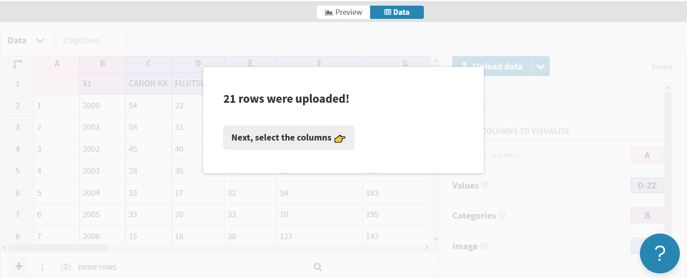
We will go to the Flourish template for creating bar chart races in Flourish and though the available upload data button we will upload our own CSV data into Flourish. Flourish will quickly recognize our data.
Show code
knitr::include_graphics("images/flourish/fig4_importcsv.png")
We have to make sure that we add all columns containing values that are relevant to our bar chart race visualization to the “Values” setting. We can still change and adjust some data such as column names or removing columns in case there is some bits of data that we do not want, etc. For example, we just edit and name Applicant the column containing all applicant names.
Show code
knitr::include_graphics("images/flourish/fig5_importcsv.png")

Our data imported well so now just by going into the Preview tab, we should be able to see it in action.
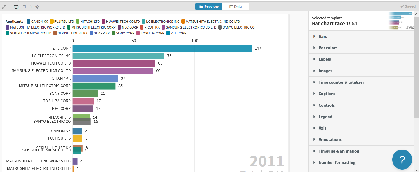
Preview, tweeking and publishing
The preview of our chart will appear to the left hand side of the screen. In the right we have full control of all parameters to tweak the styles of this visualization (labels, sizes, animation time, etc.).
All changes we do are saved automatically and our animation updates. It will appear published in our public account (this is the default setup option) or we can share it, make it private or embed it anywhere, given that we have associated privileges (upgraded account options).
Show code
knitr::include_graphics("images/flourish/fig6_visualization.png")