Chapter 5 Patent Classfication
This chapter focuses on the use of patent classification codes in patent analytics. Patent documents are normally awarded classification codes or symbols that describe the technical content of the document. For those unfamiliar with patent classification schemes the closest systems are library classification codes such as those used to order the items on the shelves of a university or local library.
Classification systems are important because once we are familiar with them we can navigate to the right part of the library with ease to retrieve the relevant item. For example, in the international patent system documents relating to genetic engineering are commonly found under Subclass C12N while those that relate to plants in agriculture are under A01H and animals are found under A01K. In contrast we would find kitchen equipment under Class A47. As we will see in this chapter, in contrast with simple library classification codes, patent documents are normally assigned more than one code to more fully describe the technical content of a document. So, if we wanted to identify those patent documents that involve biochemistry and plant agriculture we could search for those documents that share Subclass C12N (genetic engineering) and plant agriculture (A01H) to identify those documents that are about both subjects. Patent classification systems are also hierarchical meaning that we can navigate to greater and greater levels of detail.
The original purpose of patent classification systems was to facilitate the retrieval of patent documents as prior art through the physical ordering of patent documents in patent office libraries. As patent offices expanded classification was also used to assign work to relevant sections of examining teams (e.g. Chemistry, Electrical Engineering etc.). As such, patent classification is important to the organisation of the work of patent offices. Increasingly, in the context of the rise of machine learning and artificial intelligence, patent offices are exploring the possibility of automating at least part of the time consuming task of patent classification as part of the organisation of their work.
For patent analytics it is important to recognise that the use of classification codes has changed over time and continues to be dynamic. Thus, initially patent documents were awarded one classification code focusing on description of the contents of the claims. The number of codes assigned to a documents was gradually expanded with the first in the list generally being the most important with respect to the contents of the claims. In the early 2000s this began to change with the focus shifting towards the use of multiple classification codes to describe the technical content of patent documents. Patent classification is also dynamic as specialist bodies responsible for classification respond to changes in technology and issue revised editions of classification schedules and take advantage of databases to retrospectively reclassify entire collections. This means that old assumptions that the first classification code on a document was the most important is no longer true and that analysts must pay attention to revisions to classification schemes.
For patent analysts understanding patent classification systems is fundamentally important for four main reasons:
- When combined with keywords it provides powerful tools for narrowing patent searches and dataset generation;
- It allows for trends in particular areas of science and technology to be identified for statistical purposes;
- It allows for networks of co-occurrences of classification codes to be mapped to allow the components of landscapes to be identified and explored;
- combined with citation analysis patent classification may allow the identification of the main paths or trajectories of emerging areas of science and technology.
There are a number of patent classification systems that are in use. In some cases, such as the patent office of Japan, a national classification system will be used. These national systems can help analysts to navigate the particularities of individual systems. However, for international patent research the two most important classification systems are:
- The International Patent Classification (IPC) administered by WIPO and established by the 1971 Strasbourg Agreement.17. The IPC consists of over 74,000 classification codes.18
- The Cooperative Patent Classification (CPC) operated by the European Patent Office and USPTO. The CPC is based on the earlier ECLA system and can be considered to be a more detailed version of the IPC using just over 260,000 classification codes 19. The CPC is also used by a number of EPO national offices, the Chinese State Intellectual Property Office (SIPO), the Korean Intellectual Property Office (KIPO), the Russian Federal Service for Intellectual Property (Rospatent) and the Mexican Institute of Industrial Property (IMPI).20
One challenge for patent analysts who have not received training in patent examination is that there are limited resources available for training in the use of the patent classification schemes. Essential resources for the IPC include the WIPO Guide to the International Patent Classification (2022) available in English, French and Spanish and regularly updated. For the CPC it is important to familiarise oneself with the CPC website and its section with free training resources. esp@cenet also provides a very valuable Cooperative Patent Classification search tool.
The purpose of this chapter is to introduce the reader to the most important features of patent classification for the purpose of patent analytics. We will use the US PatentsView ipcr table that is available free of charge from the following link http://data.patentsview.org/20190820/download/ipcr.tsv.zip to explore the uses of the classification. We will then examine the use of co-occurrence network analysis using the WIPO Patent Landscape Report on Animal Genetic Resources to illustrate how an understanding of the relationships between classification codes can be used to make sense of very noisy data. Finally we will consider recent developments focusing on the use of vector space models to assist with patent classification based on a dynamic Lens public collection of articles on patent classification.
5.1 Exploring the International Patent Classification
The International Patent Classification in 2019 consisted of over 74,000 classification codes consisting of alphanumeric codes. The IPC is hierarchical in nature moving from the most general level (Section) to the most detailed level (Subgroup). The IPC is ordered in the sections displayed in Table 5.1.
| Section | Description |
|---|---|
| A | HUMAN NECESSITIES |
| B | PERFORMING OPERATIONS; TRANSPORTING |
| C | CHEMISTRY; METALLURGY |
| D | TEXTILES; PAPER |
| E | FIXED CONSTRUCTIONS |
| F | MECHANICAL ENGINEERING; LIGHTING; HEATING; WEAPONS; BLASTING |
| G | PHYSICS |
| H | ELECTRICITY |
Each Section of the IPC contains a set of codes on the Class, Subclass, Group and (where relevant) the Subgroup level. An illustration of a full classification code is A01H5/10 which is built from the following hierarchy.
A - Section = Human Necessities
01 - Class = AGRICULTURE; FORESTRY; ANIMAL HUSBANDRY; HUNTING; TRAPPING; FISHING
H - Subclass = NEW PLANTS OR PROCESSES FOR OBTAINING THEM; PLANT REPRODUCTION BY TISSUE CULTURE TECHNIQUES
5/00 - Group = Angiosperms, i.e. flowering plants, characterised by their plant parts; Angiosperms characterised otherwise than by their botanic taxonomy
5/10 = Subgroup = Seeds
In the example above we can appreciate the basics of the hierarchy in constructing the classification code A01H5/10. The first point to note is that the classification can be difficult to read in a normal human way. In approaching this task it is generally best to start at the lowest possible level to construct a human understandable summary description such as the use of seeds from angiosperms to create new plants. The second point to note is that it is important when seeking to interpret these codes to review the relevant entries in the online classification tool to understand what is nearby in the classification and the relevant notes. Notes in the IPC provide guidance to examiners on the appropriate place to classify a document.
By way of illustration consider the following under A01H in Table 5.2.
| Code | Description |
|---|---|
| A01H | NEW PLANTS OR PROCESSES FOR OBTAINING THEM; PLANT REPRODUCTION BY TISSUE CULTURE TECHNIQUES [5] |
| A01H 1/00 | Processes for modifying genotypes (A01H 4/00 takes precedence) [2006.01] |
| A01H 3/00 | Processes for modifying phenotypes (A01H 4/00 takes precedence) [2006.01] |
| A01H 4/00 | Plant reproduction by tissue culture techniques [2006.01] |
| A01H 5/00 | Angiosperms, i.e. flowering plants, characterised by their plant parts; Angiosperms characterised otherwise than by their botanic taxonomy [2018.01] |
| A01H 5/02 | • Flowers [2018.01] |
| A01H 5/04 | • Stems [2018.01] |
| A01H 5/06 | • Roots [2018.01] |
| A01H 5/08 | • Fruits [2018.01] |
| A01H 5/10 | • Seeds [2018.01] |
| A01H 5/12 | • Leaves [2018.01] |
When viewed from the fuller IPC we can make a number of observations. The first of these is that A01H5/10 describes the part of a plant used in the claimed invention. Second, we can see instructions to examiners to the effect that code A01H4/00 takes precedence (priority) over the use of either A01H1/00 or A01H3/00 with respect to modifications of genotypes and phenotypes respectively. In our human readable summary of this data we can describe this as the use of seeds from angiosperms to create new plants because A01H4 refers specifically to plant reproduction by tissue culture techniques and should be present on documents where tissue culture techniques are used.
As this suggests, when approaching analysis of a particular area of the patent system it is useful to begin by consulting the IPC and the codes around a potential area of interest to work out which codes might need to be included in the construction of a search to capture the universe of activity. Three additional observations are important here.
- As we can see above the year and IPC edition appear in brackets after the code entry. For items under A01H5/00 note we can see that this is a 2018 addition to the classification and, depending on the year the updated IPC was released (e.g. 2022), may not yet be fully reflected in patent databases as a result. Increasingly, patent documents in major databases are reclassified shortly after the adoption of new editions of the IPC. However, it is worth bearing a potential lag time in mind.
- Some classification codes are essentially descriptive rather than being about a technology. Thus, A01H5/00 describes parts of plants, C12R describes microorganisms and A61P describes diseases/medical conditions. In contrast, A01H4 and A01H3 describe technologies or methods.
- When constructing patent searches with classification codes care is required with respect to the use of five character (e.g. A01H5) or eight character strings (e.g. A01H5/00) because different results may be retrieved depending on the database used. Thus, the use of A01H5 in conducting a search should capture everything that appears under A01H5. However, a search for A01H5/00 will capture only documents literally coded as “A01H5/00”. As noted above, patent databases may also vary in terms of which edition of the classification they are using at a given time.
5.2 The US IPC Table
The USPTO makes its patent data available free of charge in table format for download from the Patents View website https://www.patentsview.org/download/. This is an excellent service and it is recommended that anyone interested in patent analytics should engage with this fundamental resource. In this section we will explore the 2019 IPC table for granted patents and you should expect that numbers will change if you use the latest edition.
The first observation to make is that the 2019 IPC table consists of 15,190,916 rows and 6,625,659 unique patent documents.21 As these numbers suggest on average each document receives 2.2 classification codes. A single patent document may also appear in more than one area of the classification (e.g. Agriculture and Biochemistry). We will explore this in more detail below.
Table 5.3 displays the number of occurrences of codes in each section (the same code may appear multiple times) and a count of the number of documents in each section. Note here that a single document may appear in more than one section (e.g. A and C) but is counted only once in each section.
We can readily see that the most frequently occurring classification codes across all years of the US data are in Electricity (H) and Physics (G) followed by Performing Operations and Transporting (B). As we will see below some areas of the classification (notably Physics and B for Performing Operations and Transporting) may commonly co-occur with documents in other areas of the classification.
| section | Description | document count | ipc count |
|---|---|---|---|
| A | HUMAN NECESSITIES | 1034299 | 2049387 |
| B | PERFORMING OPERATIONS; TRANSPORTING | 1219010 | 2168833 |
| C | CHEMISTRY; METALLURGY | 833582 | 1852281 |
| D | TEXTILES; PAPER | 221211 | 268316 |
| E | FIXED CONSTRUCTIONS | 196842 | 327027 |
| F | MECHANICAL ENGINEERING; LIGHTING; HEATING; WEAPONS; BLASTING | 587207 | 1072005 |
| G | PHYSICS | 1955738 | 3563913 |
| H | ELECTRICITY | 1727199 | 3887862 |
This data helps to demonstrate that multiple classification codes will be applied to a more limited set of documents. One way to think about this is as a cloud of classification codes that surround documents in order to describe their contents. Those codes will form create clusters depending on the number of documents that share a code.
One challenge with the IPC is how to visualise it at scale. Here we can use more recent visualisation techniques that will allow us to understand structure and to visualise relationships between elements within the structure.
Figure 5.1 displays the USPTO IPC data in a static sunburst diagram. The purpose of this static image is to familiarise you with what you are looking at before going dynamic. To read this diagram, start in the centre which contains the entire IPC and its occurrence count for US granted patents. The next circle from the centre is the section level followed by the class level. While this image is static, we will switch to interactive versions below. The code used to generate this graph is drawn from the sunburstR package developed by Mike Bostock and collaborators. The sunburstR package implements the original D3 code developed by Mike Bostock and uses the sunburst code example developed by Kerry Roden https://bl.ocks.org/kerryrodden/7090426.
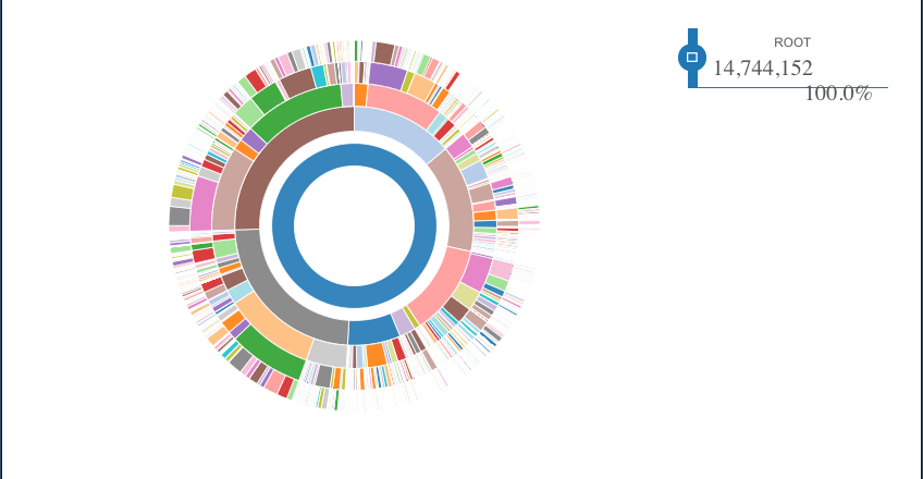
Figure 5.1: Visualising the IPC Hierarchy in a Sunburst Diagram
The sunburst graph displays the IPC in the central blue circle with 14,744,152 occurrences of classification codes from the US collection. The next circle is the section level beginning with A at 12 o’clock and proceeding clockwise to H (electricity). The third circle is the class level with the size of each class reflecting the number of occurrences. The fourth circle moves to the subclass level (e.g. A61) and the outer circle is the group level (e.g. A61K31).
This type of visualization is useful for understanding the proportion of patent activity in terms of the use of classification codes. Thus, moving clockwise we can see that A, B and C are roughly proportional at the Section level. However, D (textiles and paper) and E (fixed constructions) are striking in how small they are relative to the rest of the classification. In contrast Sections G (Physics) and Section H (Electricity) are roughly proportionate and larger than sections A to C.
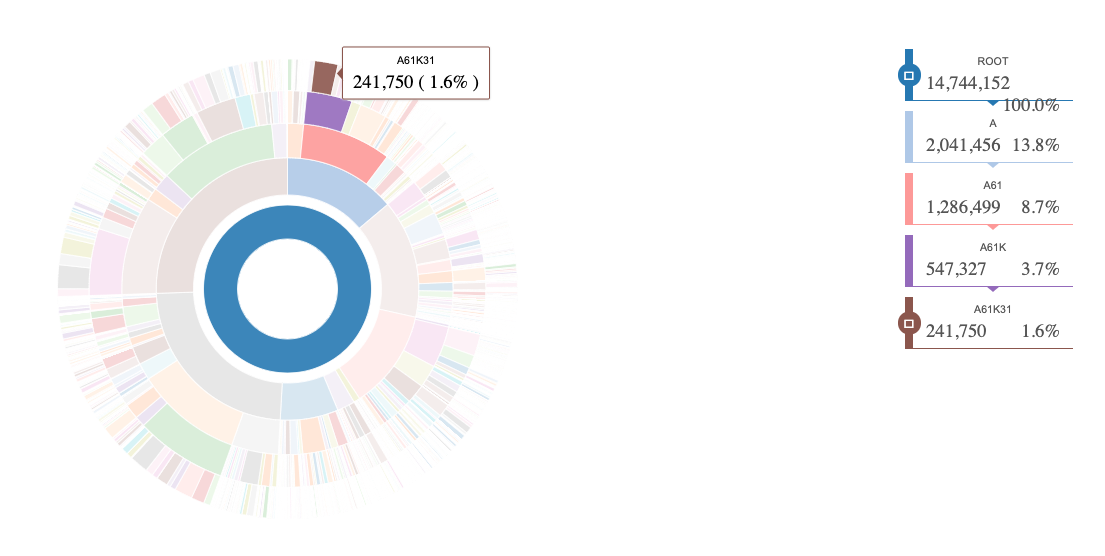
Figure 5.2: Navigating Section A to the Group Level
Figure 5.2 reveals that we can navigate across the hierarchy down to the group level. In this case from Figure 5.1 we observe a high proportion of activity in section A just after 12 o’clock that falls under group A61K31. We have now oriented ourselves in using this type of visual.
The growing power of interactive visualisation tools such as the D3 JavaScript library also allows us to navigate into individual sections to explore activity. Figure 5.3 zooms in to subclass A01H down to the subgroup level discussed above. This version is interactive and allows the main subclass for plant agriculture (A01H) to be explored down to the subgroup level. Thus, we can readily observe that A01H5 for angiosperms (flowering plants) dominates activity in this subclass. The dominant subgroup is A01H5/00 which in reality is a reference to the group with the main subgroup being A01H5/10 for Seeds followed by the group A01H1 referring to processes for modifying genotypes. Observe here that the use of A01H1 and A01H1/00 both refer to the group level which is confusing. As noted above, for this reason it makes sense when conducting IPC searches to use A01H1 to ensure that all relevant results under this group are captured.
Figure 5.3: Exploring Agriculture in the Patent Classification
This type of 30,000 foot overview provides a better understanding of the proportion of activity in different areas of the United States Patent system than can be gained from a simple stacked bar chart. This also usefully illustrates the fundamental point that a great deal of time can be saved in patent analytics by engaging with the classification. That is, it makes sense when working on established technologies to start by using knowledge of the classification to navigate to relevant documents rather than conducting unrestricted searches. As we will discuss in further detail below, emerging technologies can prove more challenging. However, a great deal of effort can be saved by using the classification as a starting point.
Thus, taking the example that we have used so far from plant agriculture and sequencing technology we might want to use this knowledge to conduct a classification based search that combines the two classifiers A01H and C12Q and as necessary to move to more detailed levels using A01H5 and A61Q1 or into relevant subgroups such as C12Q1/68 for nucleic acids (sequences). One factor to take into account when using the classification in a search strategy or the development of indicators, particularly where working with international patent activity, is that patent offices may classify to different levels of detail. For this reason it is often necessary to move up one level (or more) from the target and to test and refine the data as needed.
As this suggests, rather than focusing on the IPC hierarchy in practice we will often want to focus on the linkages between areas of the classification. The increasing use of more than one classification code to describe the content of patent documents introduced under IPC8 represented a major step forward in this regard.
5.3 Assessing Relationships Between Technology Areas
To assess relationships or linkages between different areas of the classification we need to cast the IPC data into a matrix that shows co-occurrences between areas of the classification. Co-occurrence is based on counts of the number of documents where one or more classification code or symbol occur together.
It is a straightforward matter to create a co-occurrence matrix in Excel using a pivot table. VantagePoint makes it very easy to create matrices with the touch of a button in order to refine analysis while R and Python offer easy means to create such matrices with a small amount of programming knowledge. Table 5.4 shows a matrix of the cooccurrences of IPC sections (A to H) for USPTO patent grants across all years until 2021. In preparing this matrix, the data is first filtered so that only one IPC code is represented per section on each document. So, if an individual document has three codes from Section A and two Codes from Section B, only one section A and one section B code will be counted. We adopt this approach because our interest is in examining the relationships between sections rather than within them.
In approaching Table 5.4 note that in creating the cooccurrence matrix we also remove self-references (that is, where section A occurs with section A) by converting the diagonal values to 0. For most purposes when constructing and visualizing a co-occurrence matrix or network you will want to remove these self references (known as removing the diagonal) for a clearer view. For example, in R this can be achieved with the following simple code diag(mymatrix) <- 0.
| A | B | C | D | E | F | G | H | |
|---|---|---|---|---|---|---|---|---|
| A | 0 | 74793 | 184823 | 5205 | 10123 | 26051 | 86200 | 30268 |
| B | 74793 | 0 | 112054 | 12702 | 26170 | 90468 | 118864 | 87322 |
| C | 184823 | 112054 | 0 | 9845 | 8776 | 15670 | 55678 | 49571 |
| D | 5205 | 12702 | 9845 | 0 | 769 | 2285 | 2050 | 1689 |
| E | 10123 | 26170 | 8776 | 769 | 0 | 18668 | 15254 | 6863 |
| F | 26051 | 90468 | 15670 | 2285 | 18668 | 0 | 48185 | 44039 |
| G | 86200 | 118864 | 55678 | 2050 | 15254 | 48185 | 0 | 401008 |
| H | 30268 | 87322 | 49571 | 1689 | 6863 | 44039 | 401008 | 0 |
Table 5.4 reveals that if we read the values across the rows on the left, the top section shared with Section A is Section C for Chemistry and Biochemistry. Moving down the rows, one of the smaller areas of patent activity is Section F for Mechanical Engineering, Lighting, Heating and so on. The strongest connection from Section F is Section B for Performing Operations and Transporting.
Rows and columns and numbers can be difficult to read and interpret. For this reason a common approach in data science for visualising a matrix is to use a heatmap. A heatmap transforms the values in the matrix into colours, where lighter colours normally represent lower values and darker colours higher values, or intensity, of connections or activity. Figure 5.4 displays a heatmap view of the data presented in Table 5.4.
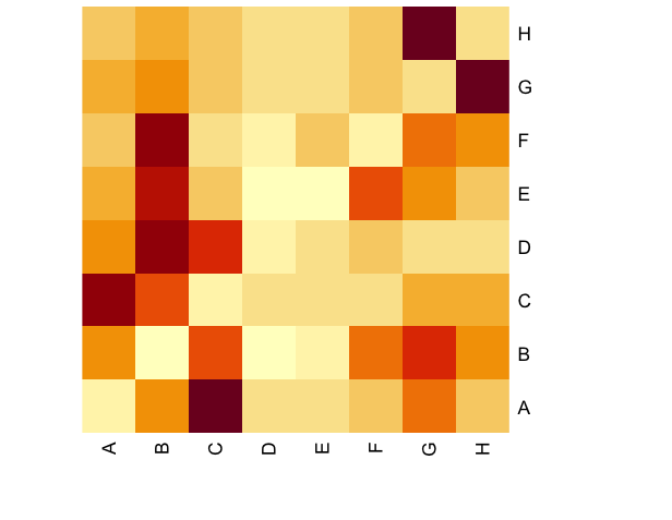
Figure 5.4: Co-Occurrence Heatmap for USPTO patent grants by IPC section
Reading this heatmap column wise from A to H we can almost immediately see that the highest area of activity for Section A is Section C (for Chemistry and Biochemistry), for Section B it is split between Section D and Section F and for C it is section A followed by D (for Textiles and Paper).
There are multiple ways in which heat maps can be constructed for different purposes to display relationships with Figure 5.4 is one of the simplest. For patent analysts heat maps can be particularly useful as exploratory devices for identifying the intensity of activity rather than as explanatory devices when communicating with a general audience. Network visualisations are typically a more effective device for visual communication with an audience as we will now see.
5.4 Visualising Relationships with Chord Diagrams
We can visualize this co-occurrence network using a Chord Diagram or a network. Figure 5.5 displays the raw connections between US patent documents classified in more than one section of the IPC. The chord diagram was generated using the easy to use circlize package in R. Similar options available in the bokeh and plotly packages in Python and R. The circilize package and software programmes such as circos are widely used in bioinformatics and genomics for visualising relationships.22
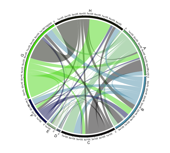
Figure 5.5: Visualising an IPC Co-Occurrence Network in A Chord Diagram
In considering this raw chord diagram we will begin at 12 noon with Section H and proceed in a clockwise direction. The most immediately striking aspect of this visualisation is that Section H (Electricity) is very strongly connected with Physics (Section G) but more weakly with other areas of activity. Section A (Human necessities) covers a broad spectrum from Agriculture to Baking and Foodstuffs, Clothing, Medicines and Games. Section A displays multiple but relatively weak links with Physics but strong links with Chemistry (a section including biochemistry and genetic engineering). Section B (Performing Operations; Transporting) encompasses a wide variety of technologies concerned with the separation and processing of materials (such as plastics), shaping of materials, printing and vehicles. This section also covers microstructural and nanotechnology. Perhaps as a reflection of this diversity and the importance of separation processes in many fields, Section B appears to display a more even distribution of linkages with other areas of patent activity.
As we move past Section C (chemistry) we observe that two smaller areas of activity in terms of links with other areas of the system. These are Section E for Fixed Constructions covering Building, Road construction and Mining followed by Section F covering Engines, general engineering, weapons and blasting.
When we compare the chord diagram in Figure 5.5 with our simple heatmap in Figure 5.4 we can observe that the chord diagram is more informative because it more clearly displays the proportions of the relationships between the different sections of the classification. However, note that the reader will need to be guided in interpreting each of these visualisations.
When presenting these kinds of data visualisations the data can be presented as is or calculations can be applied. Figure 5.6 scales the data to show the fraction of activity in a section that is shared with other sections.
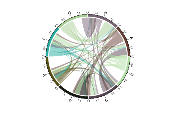
Figure 5.6: IPC Co-Occurrence Network with Fractionated Counts
We will read Figure 5.6 from 12 noon in a clockwise direction. The first point we observe at 12 o’clock is the inverted mountain of links between G (Physics) and H (Electricity) as we proceed along the axis of H a second string of linkage emerges to section G. Note however, that only limited connections are visible between H and other areas of the classification. Moving into Section A we initially observe a link to Section H before major links begin to appear to D (Textiles and Paper) and a separate major stream of links to C for Chemistry.
It is possible to draw chord diagrams of this type at variety of different levels from classes down to sub-groups. Figure 5.7 shows a chord diagram on the subclass levels in order to illustrate two points.
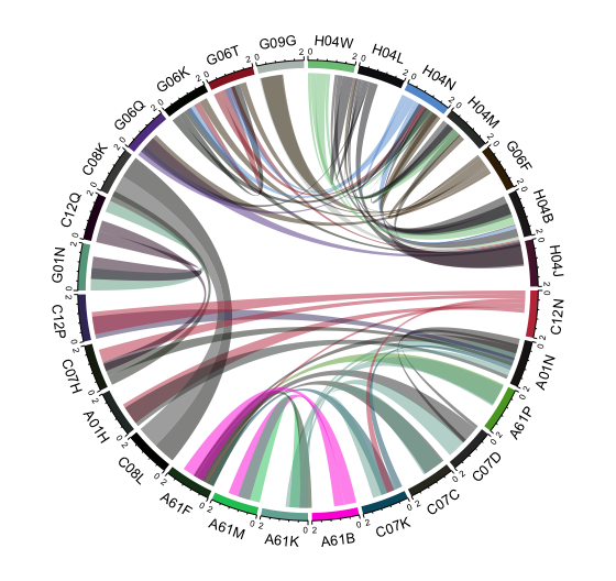
Figure 5.7: IPC Co-Occurrence Network on the Sub Class Level
The first point is that when dealing with the relationships between tens of thousands of entities it will always be necessary to filter the data. In this case to codes with 10,000 or more occurrences on the class or the subclass level respectively. The second point follows from the first. That is, visualisation is an exercise in communication with an audience. Interpretation of the codes used as labels requires an intense interest in the symbols in the classification. While it is reasonable to expect that a patent analyst will be interested in these symbols it does not follow that the reader of a patent analysis will be interested.
The issue here is not the type of visualisation. Chord diagrams are effective means for visualising relationships between categories within data. Rather the issue is with labelling. This is not confined to patent analysis but is a more general observation on visualisation, the challenge of labelling.
In the case of the IPC one challenge is that code descriptions are generally long multi-phrase statements. In practice these descriptions were not created with visualisation in mind. One solution to this problem is to edit the IPC to short one word or two word phrases that seek to capture the dominant meaning of a particular code. This exercise will never be perfect but it provides a means of visually communicating data while at the same time providing opportunities to provide narrative explanations of the nuances to the reader.
5.5 The Short IPC
The short IPC was developed by Paul Oldham and Stephen Hall to overcome the challenge of visualising IPC data in dashboard displays such as Tableau, notably labelled vertical bar charts. The short IPC was created by manually editing the complete classification in Vantage Point from Search Technology Inc in order to produce human readable labels on the section, class and subclass levels. An extended version of the short ipc includes ipc descriptions on the group level. Table 5.5 displays a sample of the short IPC.
| code | description | level |
|---|---|---|
| A01 | AGRICULTURE | class |
| A01B | AGRICULTURAL SOIL WORKING | subclass |
| A01C | PLANTING | subclass |
| A01D | HARVESTING | subclass |
| A01F | THRESHING | subclass |
| A01G | HORTICULTURE | subclass |
| A01H | NEW PLANTS | subclass |
| A01J | DAIRY PRODUCTS | subclass |
| A01K | ANIMAL HUSBANDRY | subclass |
| A01L | SHOEING ANIMALS | subclass |
| A01M | CATCHING | subclass |
| A01N | BIOCIDES, PESTICIDES AND HERBICIDES | subclass |
| A01P | TYPE OF BIOCIDAL ACTIVITY | subclass |
| A21 | BAKING | class |
| A21B | BAKERS’ OVENS | subclass |
We can join the short IPC to existing tables using straightforward SQL joins. In R with the dplyr package that looks like this. In this case we use an inner join so that only those records that match on the shared field (ipc_subclass and code in this case) are retained. We can also drop any columns that we don’t want and rename others (such as n).
That code gives us a human readable version of the data as we see in Table 5.6.
| ipc_subclass | total | description |
|---|---|---|
| G06F | 1101673 | ELECTRIC DIGITAL DATA PROCESSING |
| H01L | 804560 | SEMICONDUCTOR DEVICES |
| A61K | 630558 | PHARMACEUTICALS/MEDICINES |
| H04N | 481881 | PICTORIAL COMMUNICATION |
| H04L | 422068 | TRANSMISSION OF DIGITAL INFORMATION |
| A61B | 408181 | DIAGNOSIS |
| H04W | 317421 | WIRELESS COMMUNICATION NETWORKS |
| C07D | 259314 | HETEROCYCLIC COMPOUNDS |
| G01N | 221952 | ANALYSING MATERIALS BY THEIR CHEMICAL OR PHYSICAL PROPERTIES |
| B32B | 191818 | LAYERED PRODUCTS |
| G02B | 187885 | OPTICAL ELEMENTS |
| H04B | 184749 | TRANSMISSION |
| G06K | 179042 | DATA RECOGNITION |
| C12N | 169212 | BIOTECHNOLOGY/GENETIC ENGINEERING |
| G11C | 158372 | STATIC STORES |
| C07C | 155484 | ACYCLIC/CARBOCYCLIC COMPOUNDS |
| H01M | 141534 | BATTERIES |
| A61F | 136140 | BLOOD VESSEL FILTERS |
We will normally want to drop or rearrange columns but we are now in a position to visualise the data in a tool such as Tableau. Figure 5.8 displays a stacked bar chart in Tableau. Note that in some cases it may be necessary to edit longer labels manually, such as “Analysing materials by their chemical or physical properties” that becomes simply “Analysing Materials” in Figure 5.8 below.
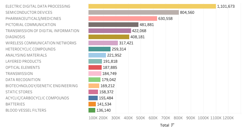
Figure 5.8: A Stacked Vertical Bar Chart using Short Subclass Labels
The use of labels also allows for experiments with visualisation of the same data in other ways. Figure 5.8 displays the same data in the form of a bubble graph.
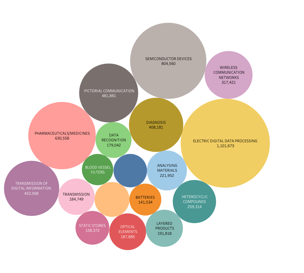
Figure 5.9: A Bubble Graph using IPC Subclass data
As this discussion reveals, there are a variety of ways of visualising IPC data. Some of these are best used for exploratory purposes for example using the IPC codes as labels while communication with an audience will normally involve the use of short text labels. In considering the stacked bar chart and bubble chart representations of the date presented above, or the raw and fractionated circle graphs presented earlier, it is always important to bear in mind what forms of visual communication will be effective for the audience in terms of accurate representation of the data.
In closing this chapter on the use of the International Patent Classification in patent analytics we will illustrate how an in depth knowledge of the IPC combined with network visualisation techniques allowed the author of this handbook to identify and visualise a needle in a haystack.
5.5.1 Case Study: Finding A Needle in A Haystack
In 2013 WIPO was invited by the Food and Agriculture Organisation (FAO) to develop a patent landscape analysis on animal genetic resources for food and agriculture. This landscape analysis covered all the major species of livestock such as cattle, pigs, goats, deer, horses, buffalo etc. as well as birds such as chickens, geese, ducks and so on.
At first sight the solution to developing this landscape appeared relatively straightforward. The IPC has a long standing subclass AO1K for New Breeds of Animals that focuses on genetically engineered animals. This seemed like a reasonable starting point. For example, in the 2021 USPTO data on the IPC used above there were 31,712 patent grants across all years that fall under subclass A01K. However, during planning of the landscape study we were also conscious that this new breeds of genetically engineered animals is a fairly narrow category. Based on previous work on biodiversity in the patent system, we thought that other references to animals could be identified by using the Latin names of animals (e.g. Bos taurus for cattle). This was based on the observation that applicants with inventions that directly involve an animal will typically use the Latin name as part of the disclosure.
This approach involved starting from a clearly relevant area of the patent classification (AO1K) and Latin terms and expanding outwards with a defined strategy to explore the wider landscape. However, one significant problem with this approach emerged in the course of exploring the data. This was that detailed analysis of the claims, performed in Vantage Point, revealed that for common livestock applicants often used common names. In addition the common names generally appeared in the claims as parts of lists that reflected the way in which claims are framed to maximise the scope of protection. Thus, cattle and other animals would appear in claims as part of lists encompassing mice, rats, humans and other mammals. Additional terms that expanded the landscape still further included grouped names such as bovines, ungulates and ruminants. Patent claims involving humans often involved references to higher order mammals.
The practical consequence of this was a requirement to use common names to develop the landscape to be sure that the universe of relevant activity had been captured. Text mining of the US, European and PCT full texts revealed a raw set of 55,595 first filings of patent applications, 98,368 patent publications and 510,595 patent family members that involved the terms. Figure 5.10 displays the rankings for patent activity worldwide based on common and Latin terms for each of the major groups.
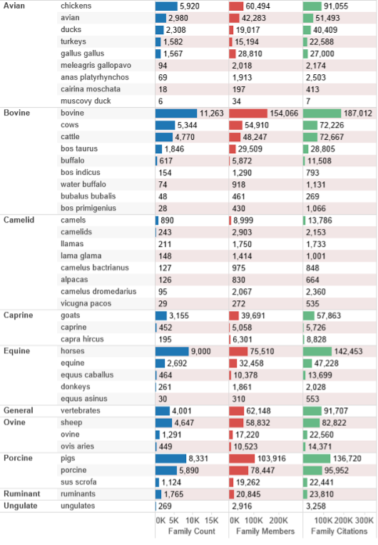
Figure 5.10: Animals in the Patent System by Terms
The scale of this data presented the conundrum of how to proceed considering that the use of animal names appears across the system in diverse areas of technology such as kitchen equipment, games, toys and clothing? In some cases, such as pigs and horses, the use of an animal name may be used in areas of technology that have nothing to do with the animal itself such as pipeline pigs and clothes horses.
The answer to this question was found by combining the IPC and CPC for the 55,595 priority records and creating a co-occurrence matrix containing 41,167 codes consisting of 17,953 IPC codes and 34,472 CPC codes. The matrix was created in Vantage Point from Search Technology Inc and then exported to Gephi where it was laid out using the well known Fruchterman Reingold algorithm. Because the data formed dense clusters we then forced the network to expand to more clearly reveal clusters. A common method for identifying structure in raw data is to use approaches such as factor analysis on one or more data fields in an effort to identify clusters. This is built into tools such as Vantage Point. Clustering methods are important but one known issue with factor analysis and other methods such as k-means clustering is the extent to which the resulting clusters can be readily interpreted by humans. However, in this case the authors were able to rely on a large number of classification codes describing the content of the documents.
In this case the authors were able to apply the modularity class community detection algorithm that comes built in to Gephi to identify communities or clusters of activity (Blondel et al. 2008). In straightforward terms, this involves iteratively calculating the strength of the links between nodes in the network and allocating nodes to a community (cluster) based on the strongest links until no further allocations can be made. Modularity class is used to partition the network by colouring the different clusters as communities.
In common with other areas of patent analysis, network visualisation is an iterative process. Figure 5.11 shows details of the emerging network with the colours representing communities of closely related activity and the IPC codes overlaid to help interpret clusters of activity.
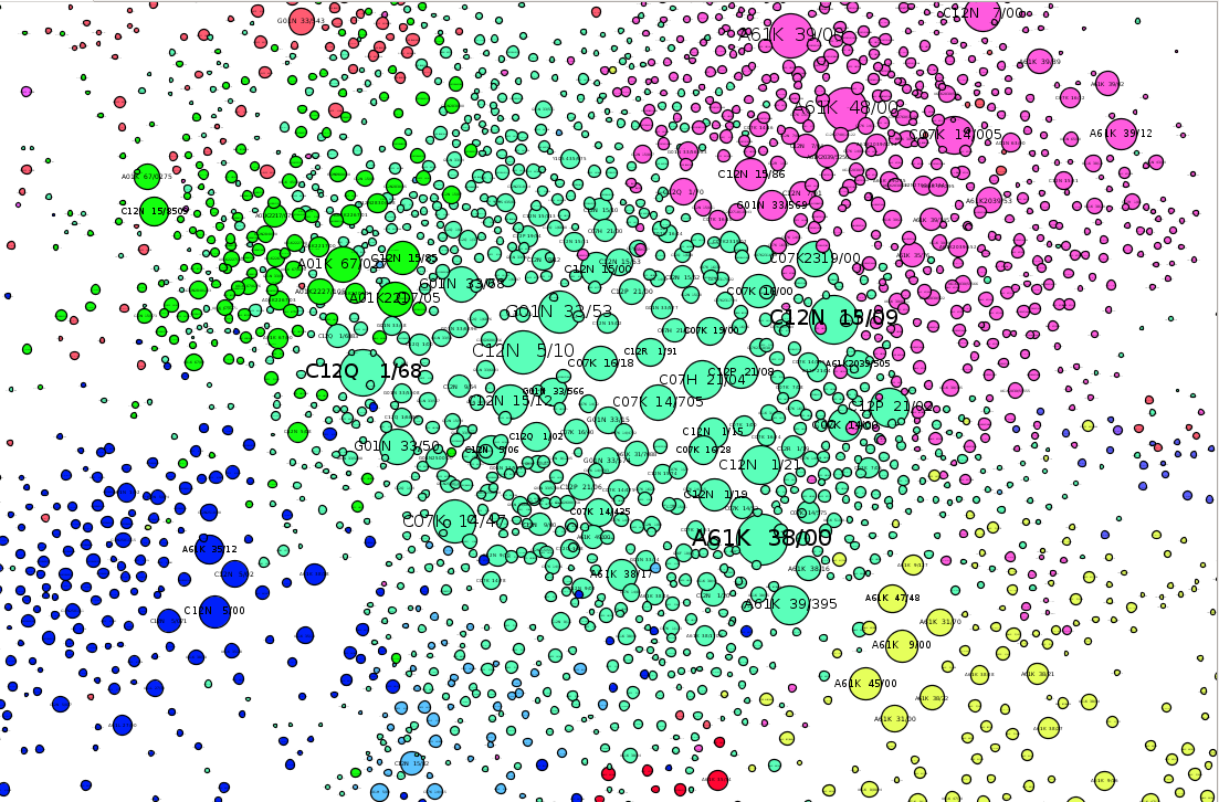
Figure 5.11: The Emerging Animal Genetics IPC Network in Gephi
Figure 5.12 shows the results of forcing the clusters to separate out to provide a clearer understanding of network structure.
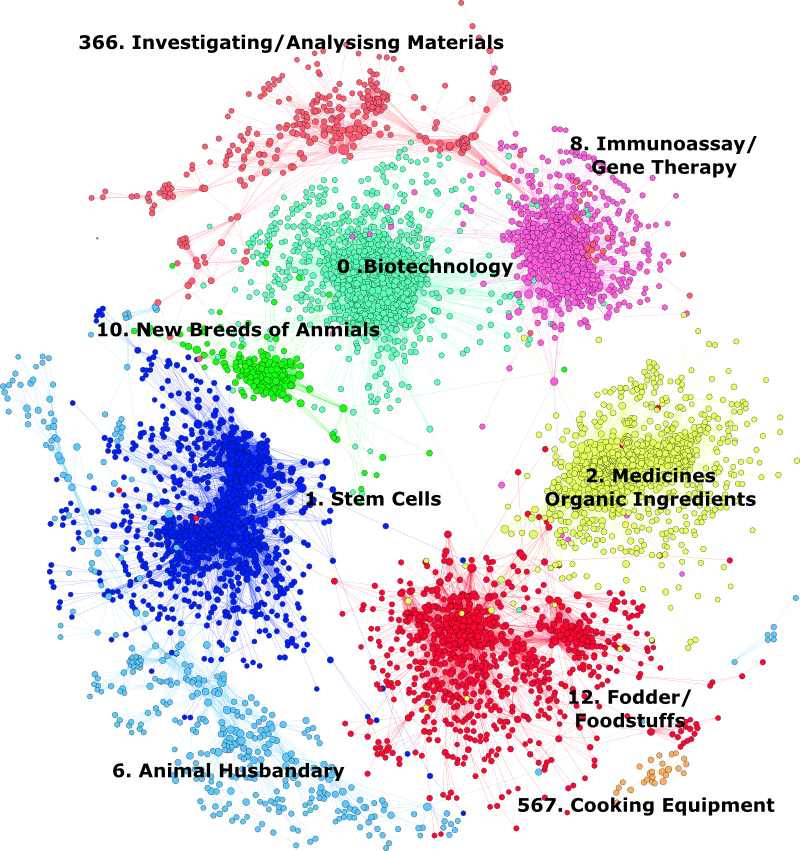
Figure 5.12: The Universe of Patent Activity for Animal Genetics
In reading Figure 5.12 note that clusters that are less closely related to other clusters, such as 567 Cooking Equipment, are forced to the outside of the network while those with stronger links are more central.
Modularity classes within a network created with Gephi are awarded a number (as shown above) that appears in the underlying data table as we can see below in what became the biotechnology cluster in the Gephi data laboratory (showing node and edges tables). Table 5.7 displays the top ten members of class 0.
| id | label | timeset | nodeweight | modularity_class | weighted degree | degree |
|---|---|---|---|---|---|---|
| 13753 | A61K 38/00 | NA | 11441 | 0 | 133354 | 1844 |
| 13754 | C12N 15/09 | NA | 7944 | 0 | 120580 | 1380 |
| 13755 | C12Q 1/68 | NA | 6586 | 0 | 69583 | 906 |
| 13756 | C12N 5/10 | NA | 5242 | 0 | 84578 | 1031 |
| 13757 | C07K 14/47 | NA | 4736 | 0 | 51915 | 664 |
| 13758 | G01N 33/53 | NA | 4680 | 0 | 59522 | 810 |
Each of the clusters in the network were manually reviewed to determine the appropriate labels in Figure 5.12 based on the frequency of the occurrences of IPC/CPC codes (node weight is a count) .
As Figure 5.12 makes clear the landscape for animal genetic resources was considerably larger than would have been suggested by a focus on activity under A01K. Co-occurrence analysis combined with community detection allowed the structure of activity to be revealed. This provided a basis for the detailed exploration of individual clusters to a high level of detail through successive rounds of community detection within each cluster. This can be illustrated through two examples. Figure 5.13 shows the communities detected within the Animal Breeding cluster dominated by subclass A01K (genetically engineered animals). Figure 5.14 focuses in on a subcluster within the biotechnology cluster focused on growth hormones and blood coagulation factors.
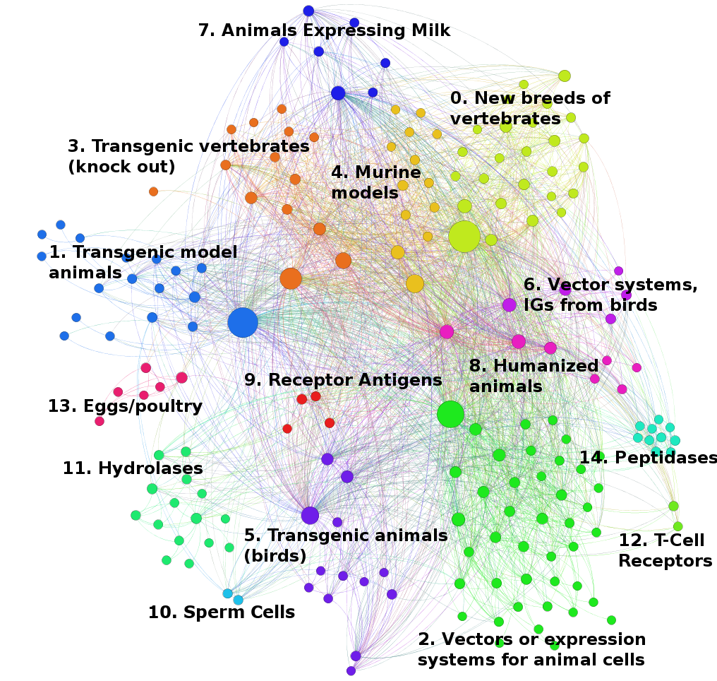
Figure 5.13: Animal Breeding Cluster
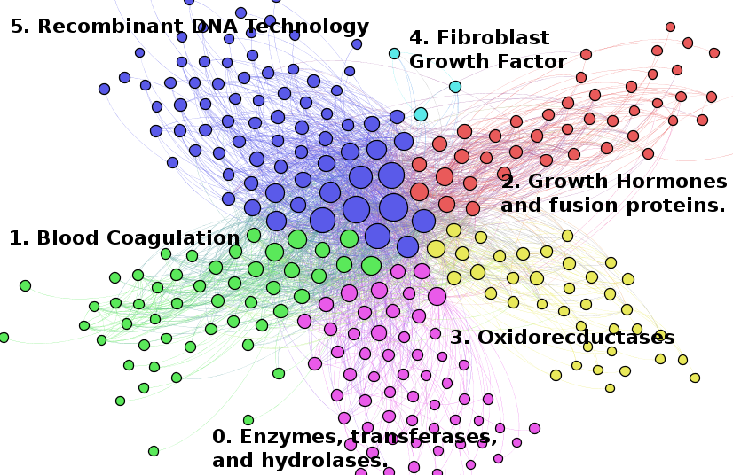
Figure 5.14: Animal Biotechnology Cluster
The important point about this approach is that the use of the classification to create a co-occurrence network when combined with a community detection algorithm allowed the main structural components of activity across 55,000 documents to be structured and explored in detail.
As this example suggests, network analysis at the level of the classification is a powerful tool for exploratory data analysis when working with noisy search terms that may be used in multiple areas of the patent system. This is particularly relevant when seeking to navigate the noise involved in full text analysis of patent data.
An important insight from this example when planning patent or wider literature analysis is to investigate whether a classification system is available before jumping towards k-means clustering, factor analysis or other methods. In the case of the patent system this is particularly important because the International Patent Classification system is a global human expert curated classification. Ignoring the IPC and the CPC is a mistake. Familiarity with the structure of the IPC combined with network visualisation allows the analyst to map and reveal the structure of patent activity in a way that makes it possible to organise communication on what are often complex topics. This does not mean that a patent analyst should slavishly adhere to the IPC, this would be a mistake in the case of emerging technologies that may be spread across multiple areas of the classification (as was originally the case for nanotechnology). Rather, the IPC is best seen as a starting point for data exploration and mapping before applying other methods. In the case study presented above, having identified the key elements of the structure of activity the authors were able to text mine in to specific clusters to explore the main features of patent activity in an organised way.
5.6 Classification and Patent Overlay Mapping
In the preceding discussion we focused on the use of the classification to identify and explore specific areas of patent activity. However, a second area of research of relevance to patent analytics is efforts to map the wider structure of science and patent activity.
The single most accessible resource for engaging with the literature on science mapping is the 2010 book by Katy Borner Atlas of Science: Visualizing What We Know that was linked to an exhibition entitled Places & Spaces demonstrating different forms of science mapping for the general public (Boyack, Klavans, and Börner 2005). Other important work on science mapping is represented by work by Ismael Rafols, Alan Porter and Loet Leydesdorff to identify the structure of scientific research using a combination of Web of Science subject area labels, factor mapping at the journal level and co-citation mapping (Rafols, Porter, and Leydesdorff 2010; Klavans and Boyack 2009a). In particular, this research has revealed an emerging consensus on the structure of scientific research as reflected in the network of relations exposed by citations. This analysis reveals a torus like structure to the scientific publications. Figure 5.15 displays the original basemap developed by Rafols, Porter and Leydesdorff based on 221 Web of Science Categories and 18 Factors (Rafols, Porter, and Leydesdorff 2010).
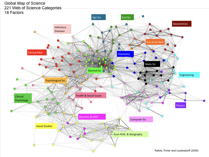
Figure 5.15: The Structure of Scientific Research
As the authors explain, the structure of the map resembles a torus or donut like structure with Economics, Politics & Geography at one side of the neck of the torus and Computer Science, Physics and Engineering on the opposite side. The lines (edges) in the structure represent the strength of connections between the different underlying subject categories with the labels in Figure 5.15 representing broad macro disciplines identified by the authors as aggregations from the factor mapping.
What is important about overlay mapping is that it becomes possible to examine the distribution of publications by different organisations or funded by different research agencies in the map of science. Figure 5.16 displays the distribution of publications from four different universities overlaid on the map of science (Rafols, Porter, and Leydesdorff 2010).
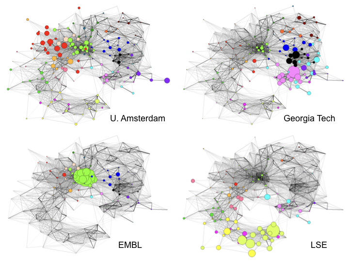
Figure 5.16: Four Universities situated in the Map of Science
In comparing these university maps we can clearly see distinct clusters of research effort across the four institutions reflected in the subject categories of publications. This, the University of Amsterdam clusters in Clinical Medicine while the European Molecular Biology Laboratory (EMBL) clusters strongly on biomedical science. On contrast, Georgia Tech cluster onto Computer Science, Physics, Engineering and Maths, while the London School of Economics and Political Science (LSE) as a dedicated social science school logically clusters on Economics, Politics, Geography and other social sciences and humanities (e.g. Law) in the underlying map (Rafols, Porter, and Leydesdorff 2010).
This type of analysis can also be extended to companies as we see in Figure 5.17 (Rafols, Porter, and Leydesdorff 2010).
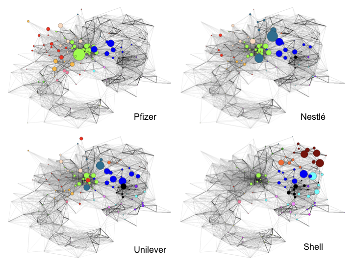
Figure 5.17: Company Positions in the Map of Science
In the case of companies we also observe distinctive clusters of research outputs supported by companies. The power of this form of representation is reflected in the way that it readily confirms some of our underlying expectations. That is we would broadly expect Pfizer to display concentrations in biomedical sciences and clinical medicine while both Nestle and Unilever are more general food and personal goods manufacturers with diverse portfolios. Finally, Shell as an oil and gas company could be expected to display concentration of activity in the Geosciences and closely related fields.
One challenge with the science overlay maps is that they depend on Web of Science journal categories and these change with reasonable frequency requiring reasonably regular updates to the maps (Carley et al. 2017). Alternative approach to science mapping include recording user clicks on scientific database websites rather than co-citation analysis. Research by Bollen et al 2009 used click stream data from nearly 1 billion user interactions to map the structure of scientific research as we see in Figure 5.18 (Bollen et al. 2009a).
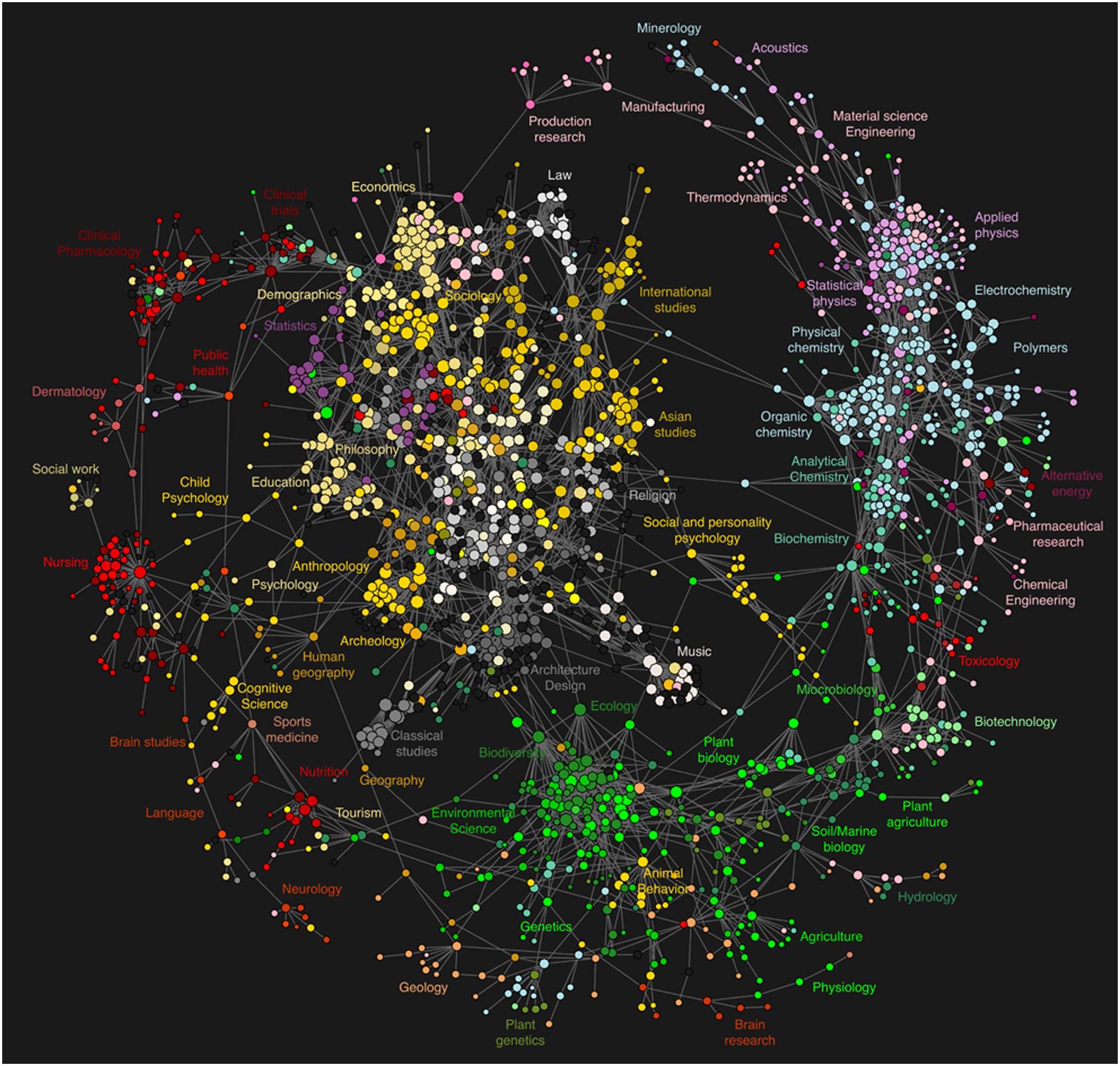
Figure 5.18: Map of Science based on Click Stream Data
The map in Figure 5.18 uses an entirely different methodology to that used in previous work to map the structure of science. However, despite important differences, note that the torus structure (in this case inverted) is strikingly familiar while the distribution of subject areas also includes some striking similarities.
An important feature of the development of science overlay maps is the use of open source software such as Pajek, Vos Viewer and Gephi and forms part of an increasing drive to transparent and reproducible methods. Researchers have also sought to extend science mapping into the patent system using patent classification systems.
5.7 The Structure of Patent Activity
The increasing availability of patent data at scale such as the EPO World Patent Statistical Database and more recently the entire USPTO patent collection, has made large scale analysis of the structure of patent activity increasingly possible and reproducible by others.
In 2012 Luciano Kay and collaborators including Nils Newman, Jan Youtie, Alan Porter and Ismael Rafols examined the cited to citing relationship between 760,000 EPO patent documents published between 2000 and 2006 involving 466 IPC codes (Kay et al. 2014).
The focus of this research was on mapping technological distance.
“Technological distance, or the extent to which a set of patents reflects different types of technologies, is a key characteristic in being able to visualize innovative opportunities” (Kay et al 2012 paraphrasing Breschi, Lissoni, & Malerba, 2003).
The argument in the literature here is that patents that cite others in the same or similar technology areas are likely to offer opportunities for incremental innovation while those that cite a variety of different technology areas are more likely to involve radical innovation (Kay et al 2012 citing Olson 2004). The IPC and other patent classifications are typically used to provide the proxy for technology categories where the citations between categories can be used as distance measures (applying various weighting techniques).
The novelty of the approach to patent mapping deployed by Kay et al 2012 was to visualise the structure of patent activity using citing-to-cited relationships. The research focused on the use of IPC categories with 1000 or more records and involved a strategy of folding up groups and sub-groups with less than 1000 records to overcome the sparsity of the population of documents in some areas of the system and resulted in a total of 466 categories spanning different areas of the IPC down to the Subgroup level. This was followed by the extraction of the citing patent records for the set and the use of factor analysis (as in the science overlay mapping). The outcome of this exercise was the IPC based ‘base map’ displayed in Figure 5.18.
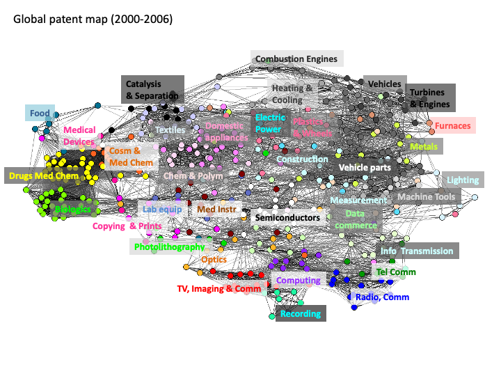
Figure 5.19: Full patent map of 466 technology categories and 35 technological areas
As we can clearly appreciate from Figure 5.18 the structure of the patent landscape revealed by citing-to-cited analysis with the IPC is very different to the scientific literature. However, as with the science overlay maps it is possible to compare and contrast the position of different companies within the map.
Using the Georgia Tech Global Nanotechnology dataset Kay et al 2012 present two maps involving nanotechnology activity by Samsung and DuPont in Figure 5.20 and Figure 5.21 below.
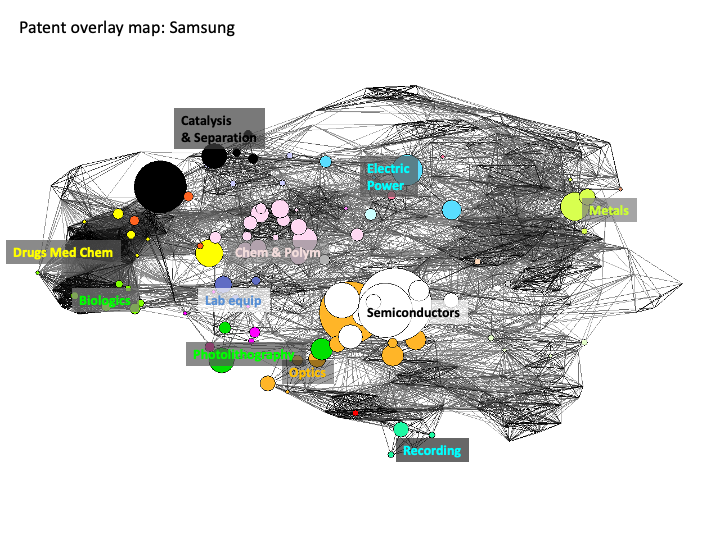
Figure 5.20: Position of Samsung in the Patent Overlay Map
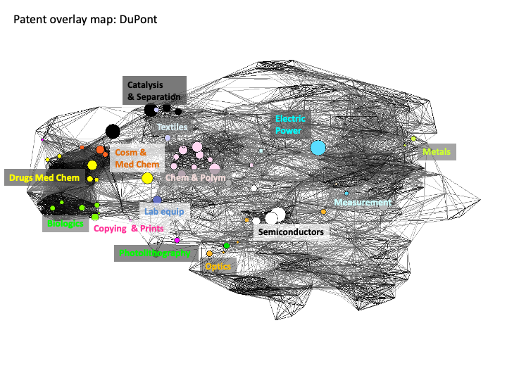
Figure 5.21: Position of DuPont in the Patent Overlay Map
The utility of this type of analysis and visualisation is that we can immediately detect the very different positions of specific companies in the structure of the landscape of patent activity for nanotechnology.
The emergence of nanotechnology in the patent system was initially dominated by the apparently scattered emergence of a new technology across multiple areas of the system. Put simply, nanotechnology did not fit inside existing categories. Patent offices later responded to the emergence of nanotechnology through the creation of a new IPC code (B82) following the development by the EPO of a classification tag Y01N. However, the challenges presented by the emergence of nanotechnology in the patent system raises wider questions of how to identify technological emergence or new and emerging technologies in the patent system (a list that could include graphene, synthetic biology, gene editing and other technologies). Developing indicators of technological emergence would be an important potential tool for informing investments and policy decision-making, particularly where this could be linked to technological forecasting. Figure graphene and biosensors are overlaid on the base map using data from the Georgia Tech Global Nanotechnology dataset.
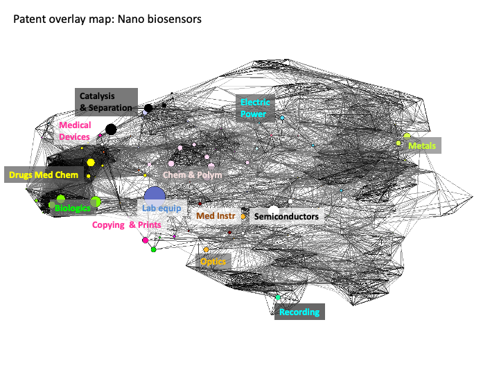
Figure 5.22: Nano Biosensors on the Overlap Map
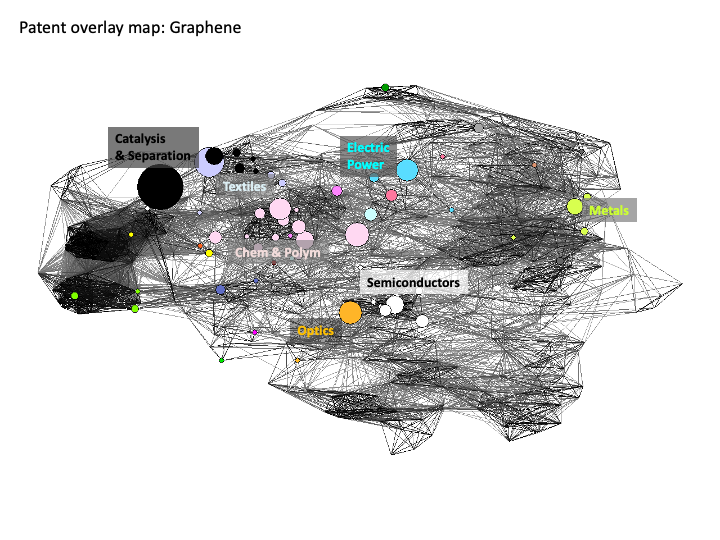
Figure 5.23: Graphene on the Overlap Map
In comparing these two visual displays for sub-areas of nanotechnology we can immediately observe the presence of medical devices and pharmaceutical drugs is much more prominent bionanotechnology while Catalysis and Separation, Optics and Electric Power are more prominent for graphene related activity.
The development of these types of maps raise many methodological questions that are being explored in the growing literature on science mapping. However, one of the most interesting findings of this 2012 study was that the areas of technology that are closest to each other when mapped using citation analysis do not necessarily appear in the same part of the hierarchy of the IPC. This leads Kay et al 2012 to conclude that:
“The finding suggests that technological distance is not always well proxied by relying on the IPC administrative structure, for example, by assuming that a set of patents represents substantial technological distance because the set references different IPC sections”.
As such, and as we have sought to highlight above, rather than seeing the IPC as involving a strict separation between areas of technology it is important to focus on the relationships between technology areas. Patent mapping of this type provides a way of visualising these relationships and allowing new and novel observations to emerge. We have focused here on one example of patent mapping with other research in the same period involving the use of inventor data and US patent data and the IPC (Boyack and Klavans 2008; Leydesdorff, Kushnir, and Rafols 2012; Schoen et al. 2012).
More recent work has demonstrated the utility of overlay maps in predicting likely trends in development in specific technology fields. For example, Song et al 2016 used the entire US patent data for 1976 to 2016 to construct a map using IPC classes that was then used to attempt to predict likely directions of growth for Hybrid Electric Vehicles (HEVs) (Song et al. 2019). Figure 5.24 reproduces a figure from this more recent work displaying the total technology space for Hybrid Electric Vehicles and its predicted areas of growth.
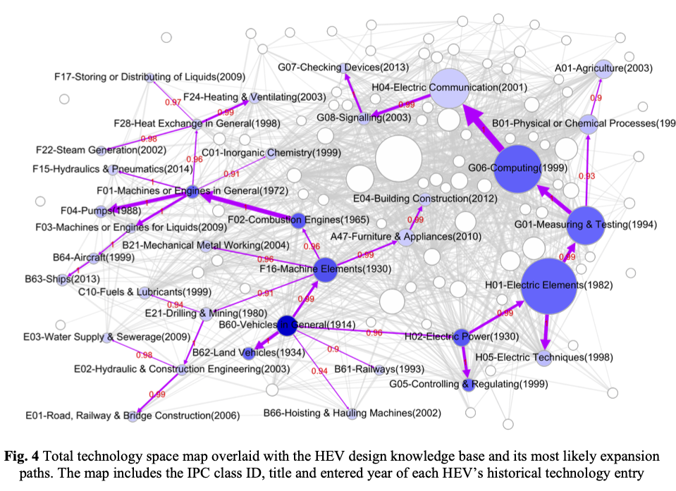
Figure 5.24: Song et al 2017 Hybrid Electric Vehicle Technology Space
These developments in the use of the IPC at scale are being accompanied by debates within the scientific literature on the appropriate statistical techniques to more accurately map and predict technological developments (see for example, Yan and Luo (2019)). At the same time, the increasing availability of patent data at scale is opening up new research questions such as measuring innovation at the city level using the IPC and US patent data (Kogler, Heimeriks, and Leydesdorff 2018).
5.8 Conclusion
This chapter has provided a detailed account of the use of the International Patent Classification in patent analytics. Starting with an introduction to the structure of the IPC we have then moved through a range of methods for visualising IPC data in order to communicate IPC based analysis to a wider audience. An important limitation of the IPC in terms of communication is that it consists of hard to decipher codes or long descriptive strings. In this chapter we presented the informal “short IPC” as a solution to this problem.
Using the WIPO patent landscape report on animal genetic resources we demonstrated that visualisation of IPC data can be a key step in understanding, navigating, partitioning and communicating complex patent landscapes. Network visualisations of IPC data are particularly powerful tools for the analyst seeking to understand an area of technology and for communication with audiences. For this reason, and commonly using open source tools such as Pajek, Vos Viewer or Gephi, network visualisations are an increasing feature of many patent landscape reports. Readers interested in getting started with network visualisation can work through a practical demonstration using Gephi in the WIPO Manual on Open Source Patent Analytics.
In the final section of this chapter we moved up in scale to consider the growth of science and patent mapping in order to inform investment, management and policy decision making. The increasing use of network and mapping techniques using the International Patent Classification forms part of a broader trend towards the use of multiple methods for patent landscape analysis at multiple scales. This convergence involves the use of multiple patent and non-patent literature data fields, the application or further development of a range of statistical measures, techniques from advanced natural language processing such as topic modelling and word or document embeddings, and other techniques. The combination falls within the description, and is a further development of technology mining or tech mining as originally defined by Alan Porter and Scott Cunningham in 2004 (Porter and Cunningham 2004).
In Chapter 7 we will focus on combining the use of the patent classification with text mining techniques.
References
https://www.wipo.int/classifications/ipc/en/general/statistics.html↩︎
Source: https://www.cooperativepatentclassification.org/cpcSchemeAndDefinitions.html↩︎
Source: https://en.wikipedia.org/wiki/Cooperative_Patent_Classification↩︎
The raw ipcr table contains a number of entries outside the A:H IPC section section scheme. These are low frequency and have been filtered out in the presentation of the data↩︎
To explore open source Circos software see http://circos.ca/.↩︎